Photography Tutorial · 2023-01-29
Is Post-Processing Just Visual Magic? A Pro Photographer on What Post-Processing Really Does
Why do so many beginners feel lost when post-processing? Because they have no direction at all — dragging sliders here and there without knowing what those adjustments are for.
Only by understanding the three major roles of post-processing can we grade and edit better.
Making up for in-camera shortcomings, enhancing visual impact, and — most importantly — injecting your own ideas and style: these are the essential roles of post-processing.
Video
▶ Watch the video tutorial on Bilibili
This is the illustrated companion to the video above. Many beginners push sliders around with no idea what they are actually doing — in this New Year opening lesson, Thomas explains what post-processing is really for: not just visual magic, but three far more important jobs. Keyframe screenshots are included throughout; skim the text for the framework, then revisit the video for the details.
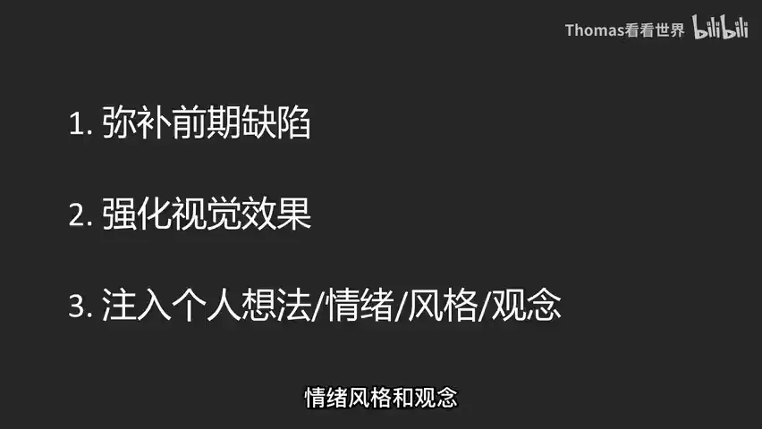
Start with the overview: this outline, captured at 1:08 in the video, lays out the three threads — fixing capture limitations, enhancing the visual result, and injecting personal ideas, emotion, style and vision. Each is unpacked below in that order.
01 Fixing Capture Limits: the Era of Multi-Frame Blends
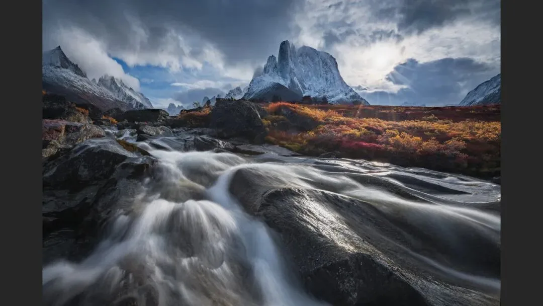
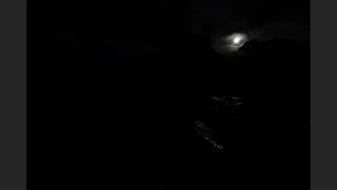
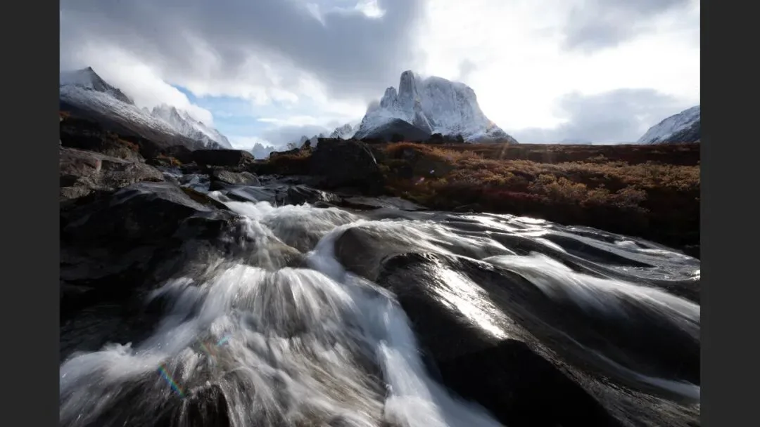
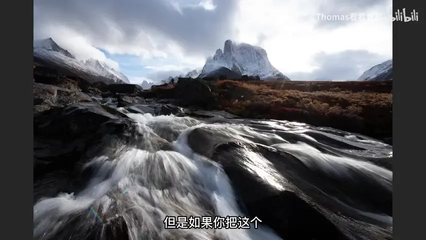
The first purpose is fixing the limitations of capture, and in today's era of multi-frame compositing it matters more than ever. The classic case is extreme dynamic range: in the frame at 1:16, both the sun and the grassy river in the foreground need to read well — your eye can handle it on site, but the camera cannot. Expose for the clouds around the sun and the ground goes pitch black; expose for the ground and the clouds blow out completely (demonstrated at 1:36 and 1:47 in the video).
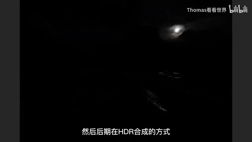
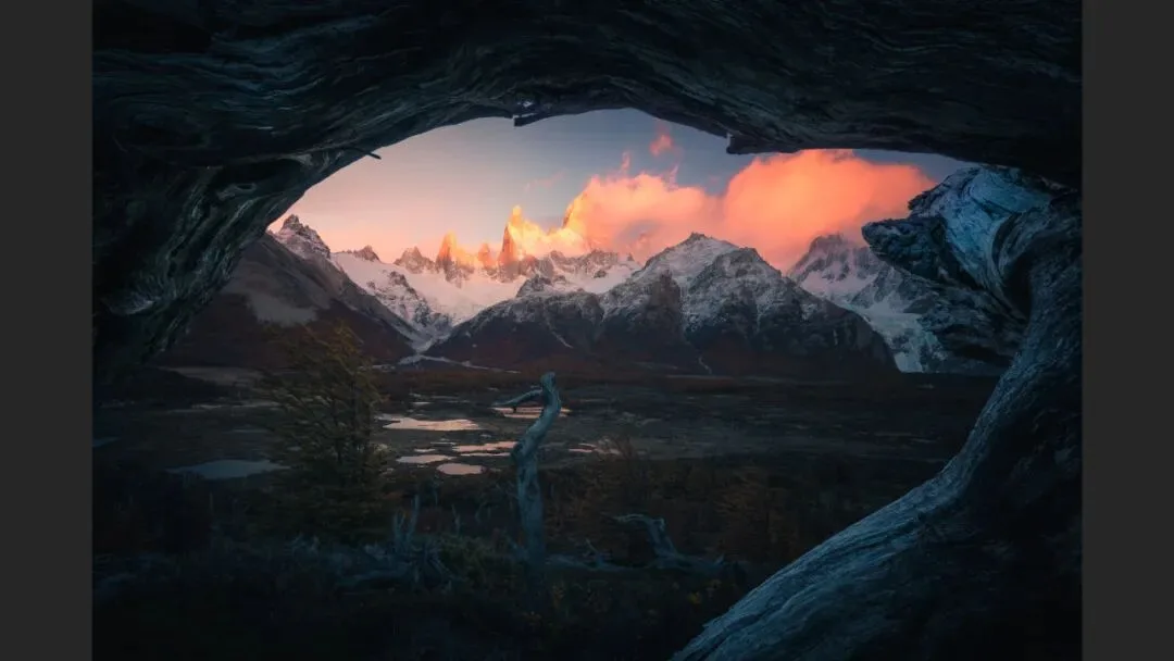
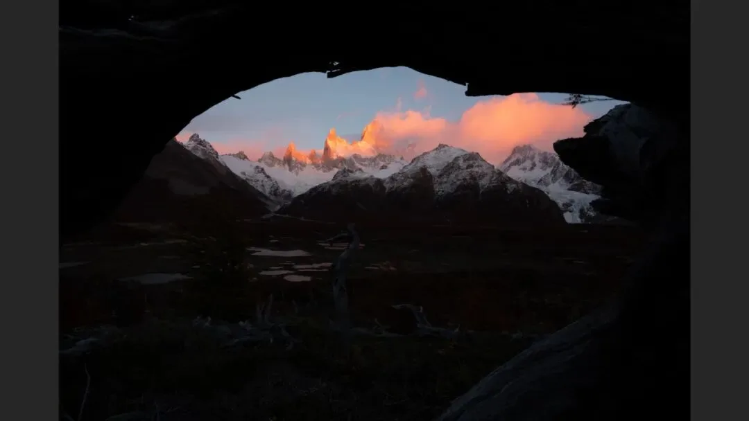
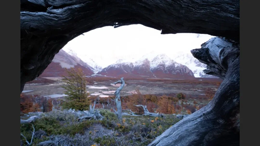
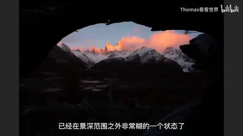
The fix is bracketing in the field and HDR blending in post — post and capture have to work together, because once you understand techniques like focus stacking and exposure blending, you deliberately shoot for them. Take the ice-cave photo at 2:04: why are foreground and background both razor sharp? It was shot separately — focus and expose for the snow mountain first, then for the dead trees in front. On its own, the foreground frame leaves the mountain overexposed and far outside the depth of field; blended, you get the best of both (at 2:24 in the video).
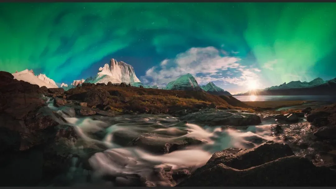
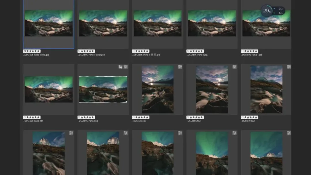
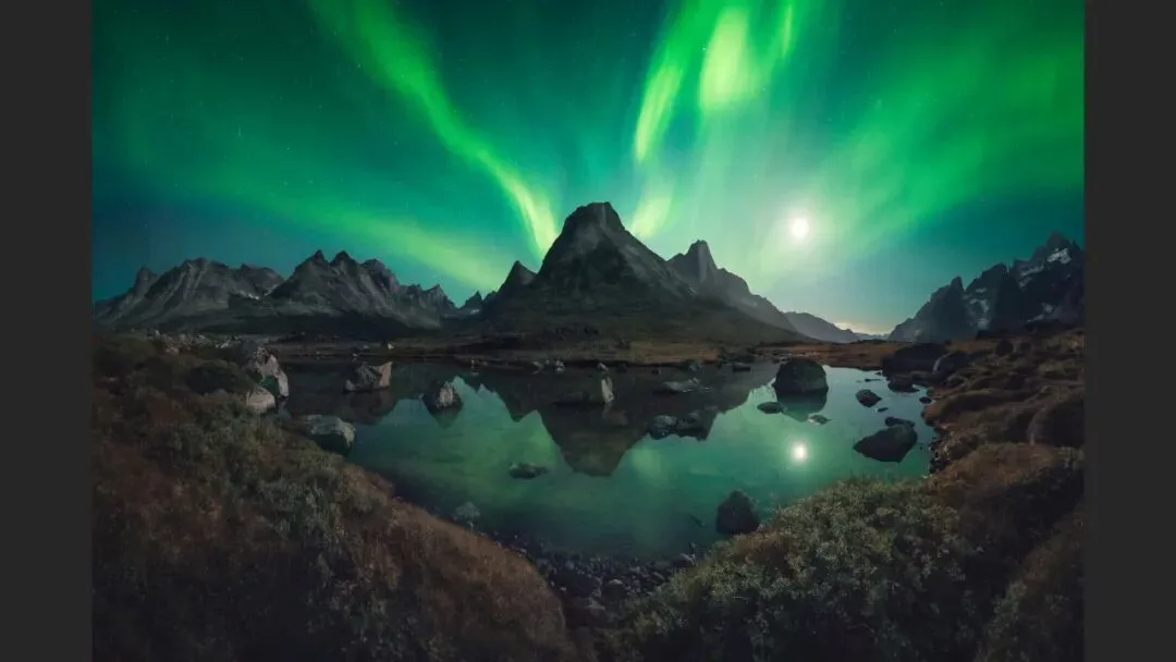
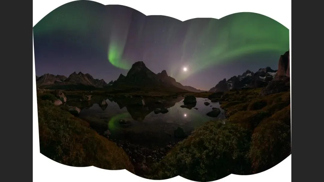
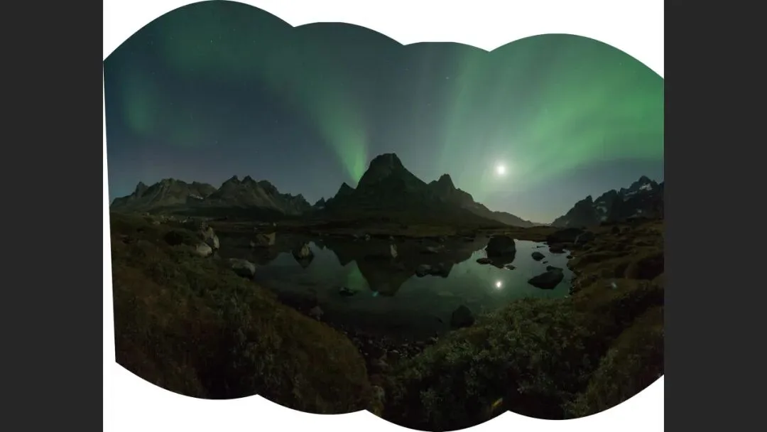
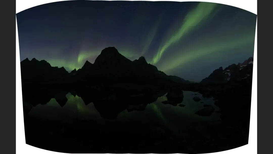
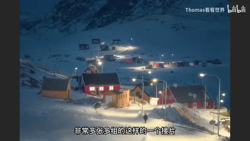
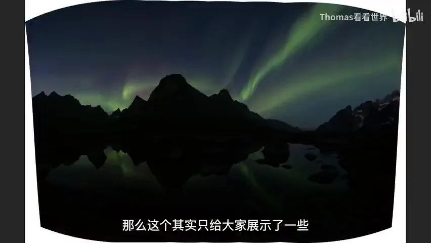
The technique Thomas now champions most is the time blend. In the night scene at 2:47, how can such a dark environment look this clean? The ground is shot first at ISO 100 with a ten-plus-second exposure for a noise-free base; then a high-ISO, slightly underexposed fast shutter frame freezes the person, who is blended into the clean background later. Auroras work the same way — the flying ribbons at a given instant are frozen at high ISO, then blended with a low-ISO ground; and if the image is also a panorama stitch, with hundreds of source files and a dozen stitched rows, it truly tests both your capture and post skills (at 3:26-3:50 in the video).
02 Enhancing the Visual: Photography Is Subtraction
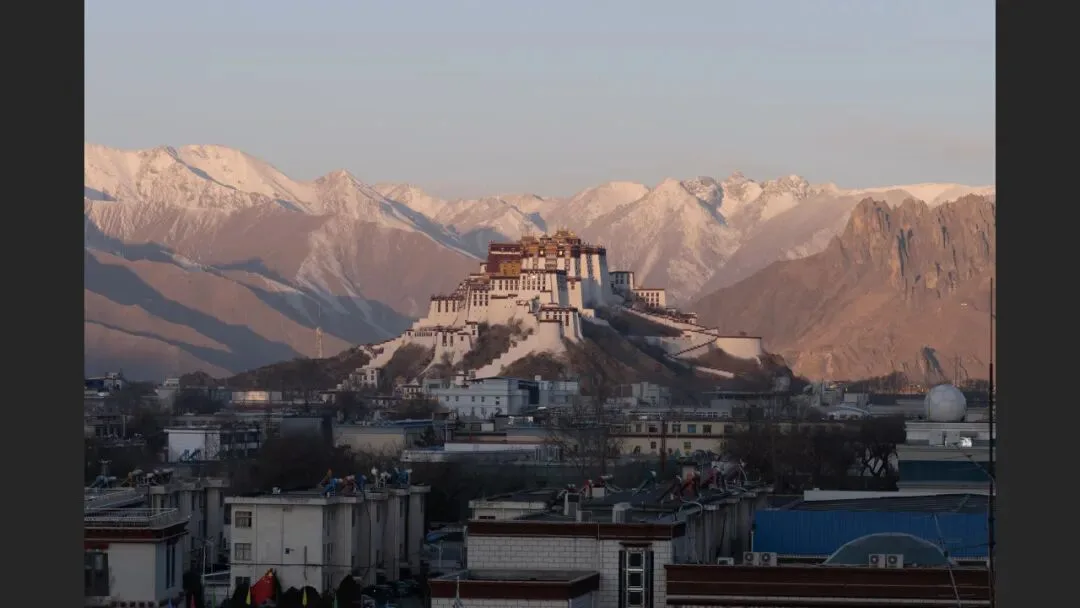
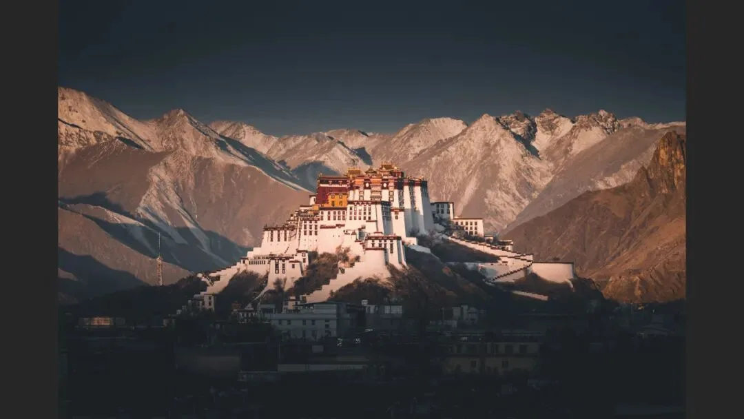
The second purpose is enhancing the visual result. Take the Potala Palace at 4:00: the original's foreground buildings are cluttered and ruin the mood, so in post they are simply darkened as a whole — and the solemn, sacred atmosphere instantly emerges. Photography is the art of subtraction, and post is where you subtract: push down or remove anything that distracts, then polish what remains until it delights (at 4:05-4:18 in the video).
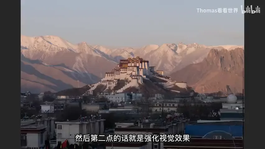
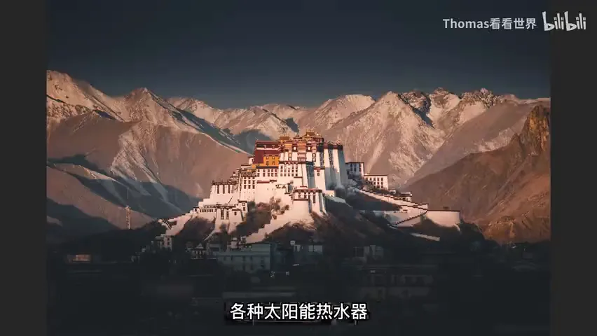
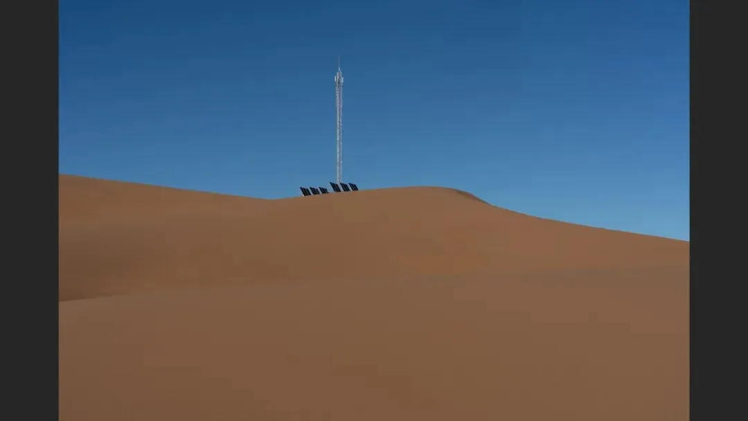
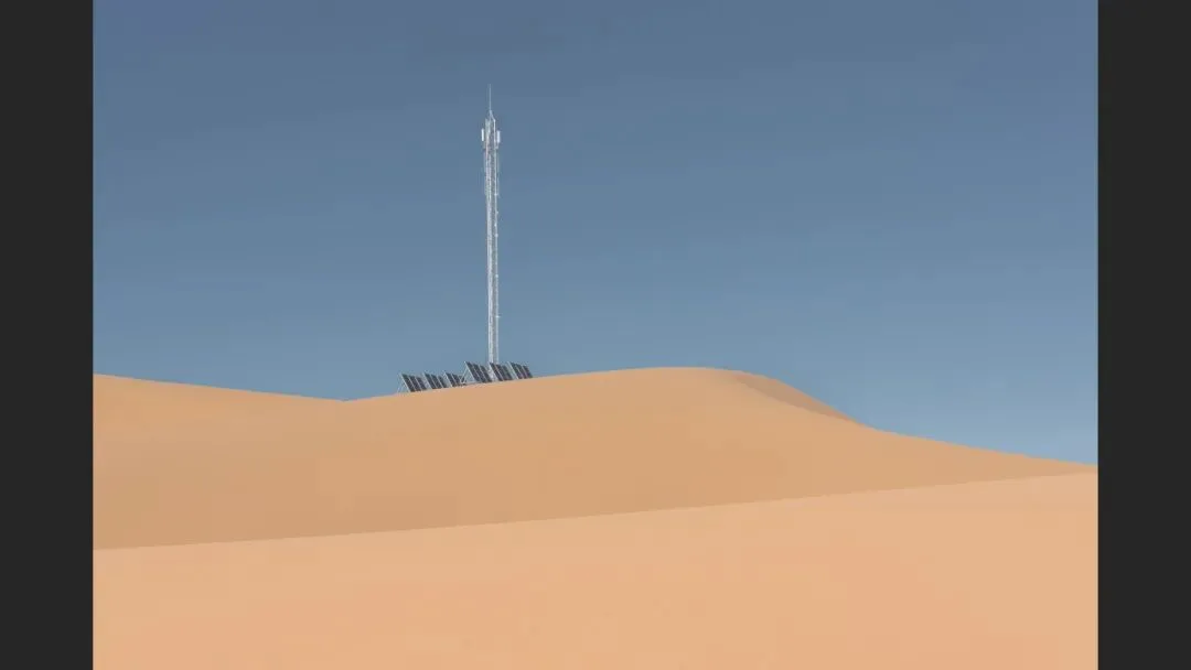
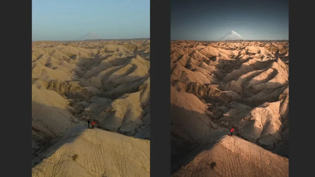
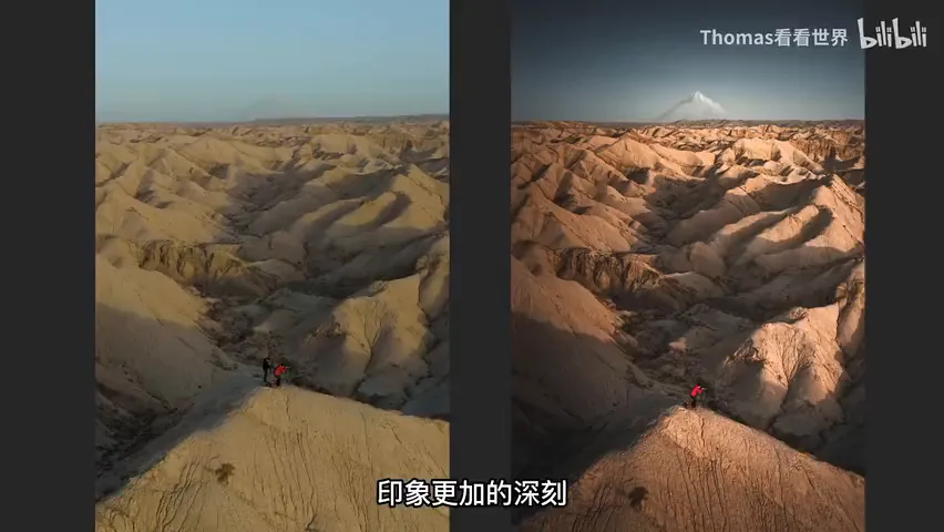
Visual enhancement also involves finer surgery: strengthening warm-cool contrast and the sense of light so the image sticks in memory; darkening the sky and brightening a snow mountain that barely reads in the original; forcibly leveling a horizon that is technically level but looks tilted because the peaks rise from left to right; and removing one of two people who dilute the mood (at 4:40-5:23 in the video). Likewise with the desert at 5:24: the original is full of tire tracks, footprints and weeds — once they are all removed, the subject immediately stands out.
03 Injecting Ideas, Emotion and Style: From Record to Expression
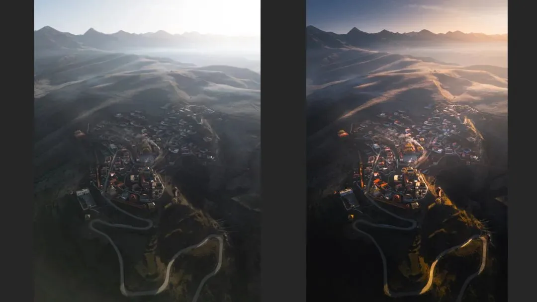
The third purpose, in Thomas's view the most important one: injecting personal ideas, emotion, style and vision. Photography is not pure scientific recording — we are not news reporters or astronomical surveyors; we are doing something creative. Ideas and style start flowing in at the concept stage, when choosing a subject and a composition, and post-processing is the stronger tool: it makes the photo not a rigid piece of scenery but the scene as you saw it, the landscape in your eyes. On Instagram, when one glance at a photo tells you who shot it, that is personal style at work — vital for professionals and advanced hobbyists alike (at 5:42-6:40 in the video).
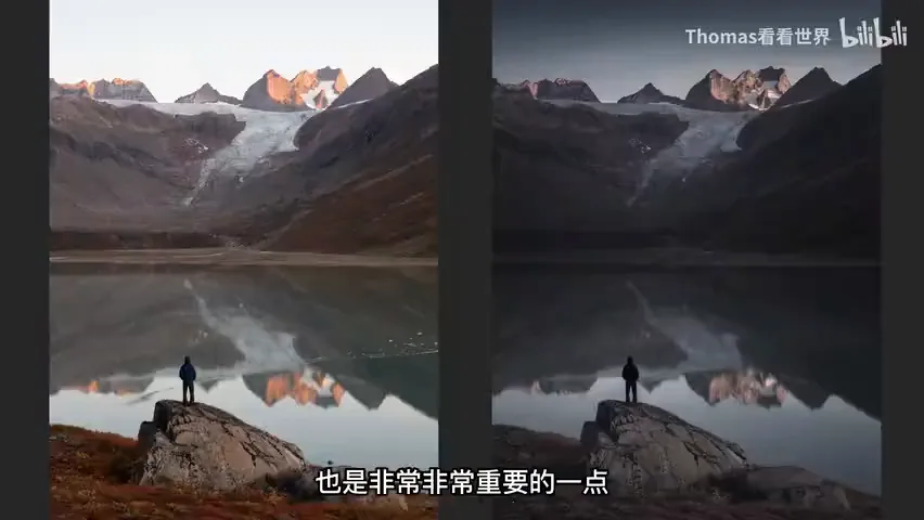
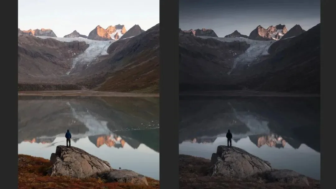
The lake photo at 6:44 involves a very simple edit: clean up the debris on the water, darken the whole frame, and shift it slightly blue. Why? Because the shot was taken in no-man's-land — not a soul for a hundred kilometres, reached by fishing boat and then a hike — and that desolation is what the photo is about. The original simply cannot convey the mood of that moment, so the feeling has to be graded into the frame.
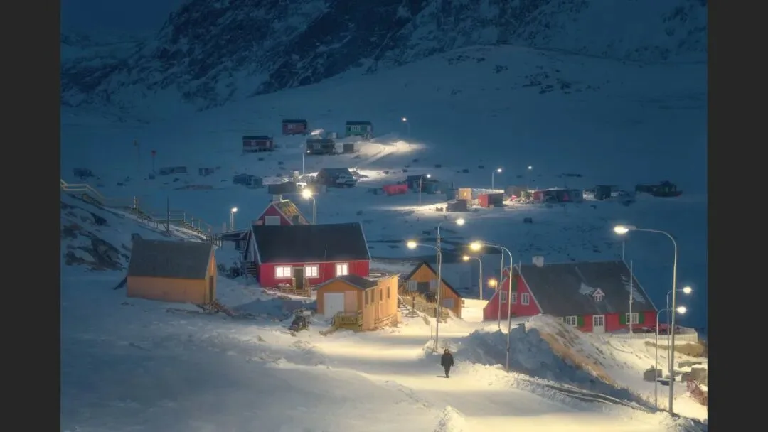
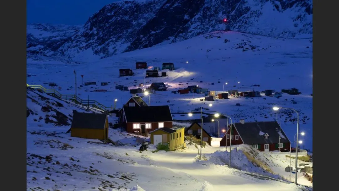
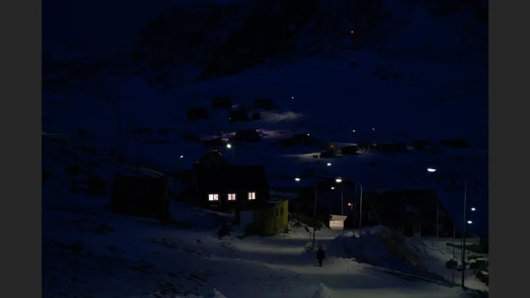
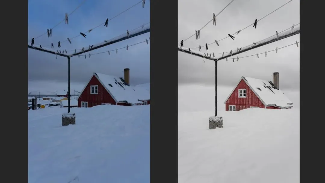
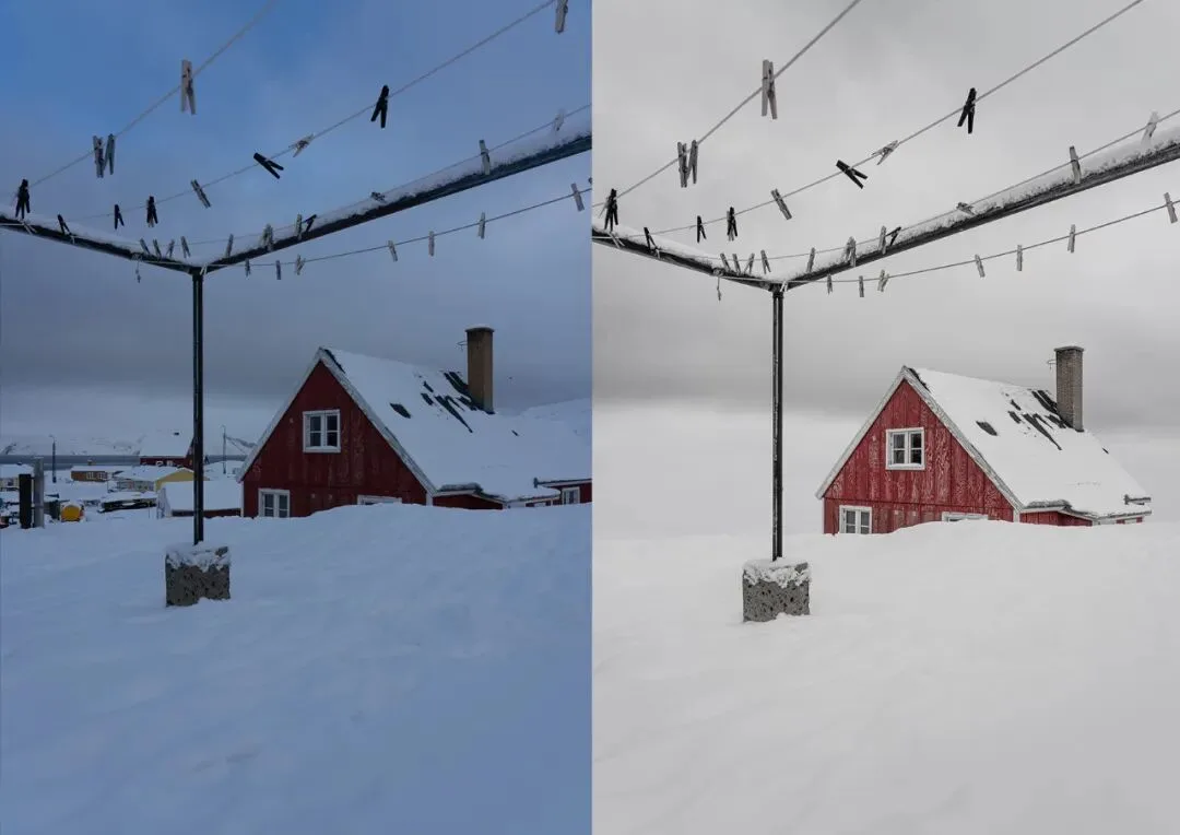
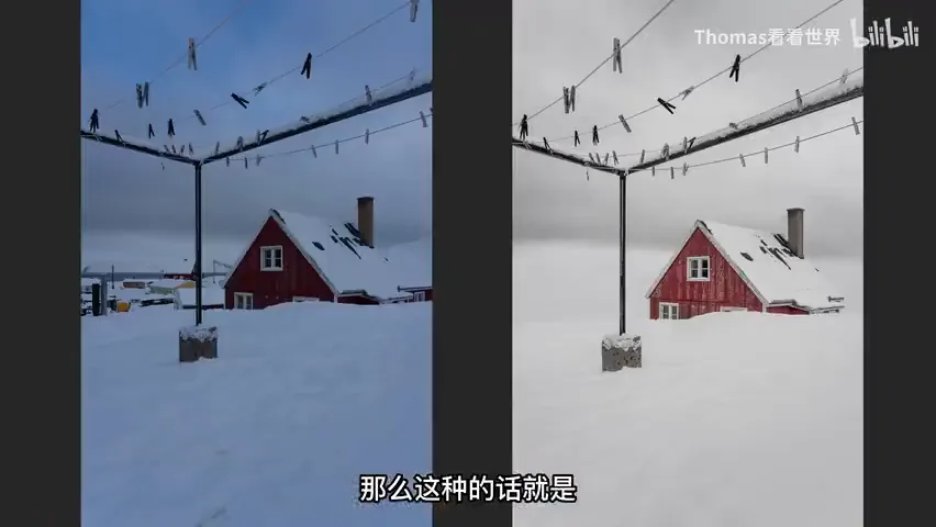
A bolder intervention is the Greenland frame at 7:24: the original has a blue sky, a different white balance, and other village houses alongside. Thomas removed the neighbouring houses — lowering the camera position could have achieved it too, but introduced other compositional problems — leaving one solitary building. In his mind, the Arctic means an island roughly one-fifth the size of China, Greenland, home to only fifty or sixty thousand people: profound isolation. The real Arctic may look like the left image; the Arctic he wants to express looks like the right one (at 8:01 in the video).
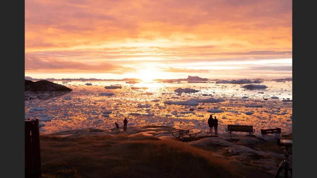
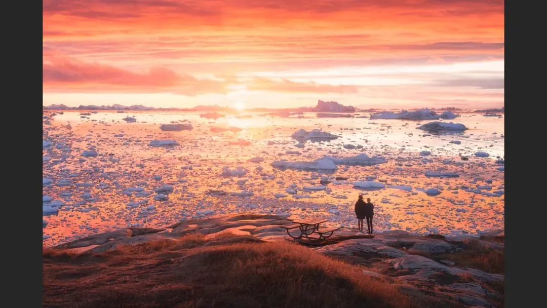
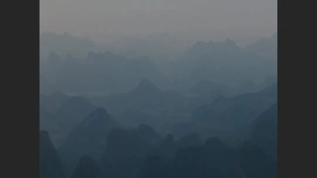
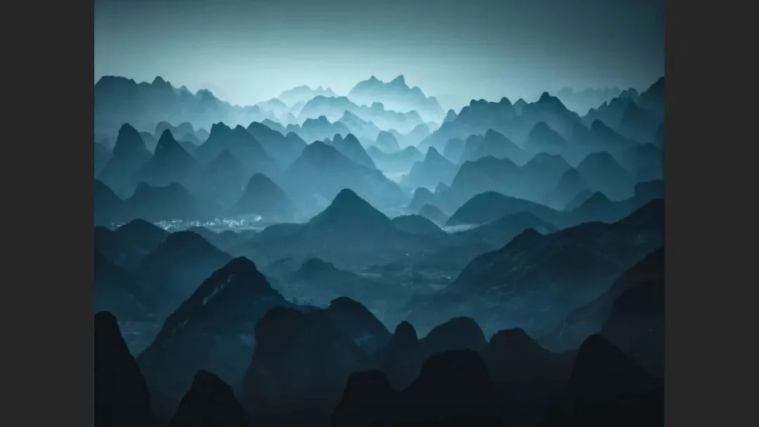
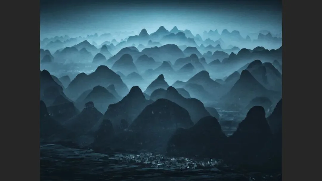
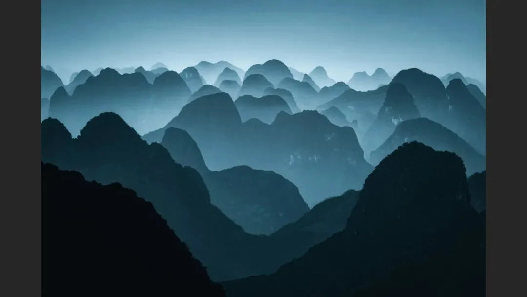
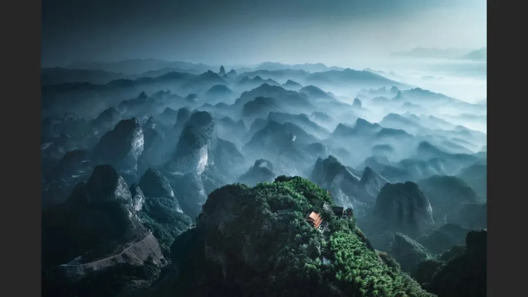
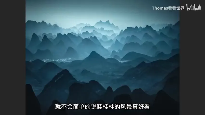
The seaside sunset at 8:16 is an even better example: the real scene was stunning — the breakwater blocked every wave, and sea and sky merged into a mirror. Yet Thomas still took the trouble to modify it, because a real scene inevitably carries clutter (the laws of thermodynamics guarantee some mess in any frame), and because it did not match the mood he wanted. Remove the clutter, grade it pinker, and the romance emerges — a stunning documentary scene becomes a photograph carrying your subjective emotion. The same logic behind his teal-toned Guilin series: viewers' first reaction is "that's Thomas's Guilin," not merely "pretty scenery" — the objective landscape now carries the photographer's personal style (at 9:11-9:42 in the video).
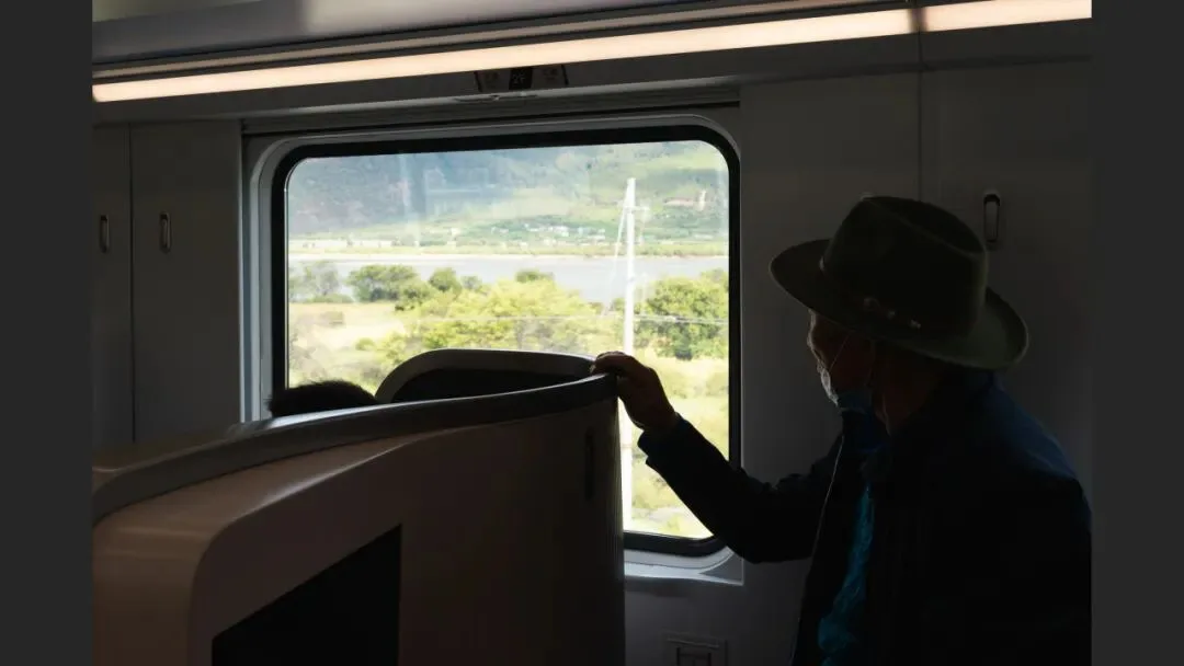
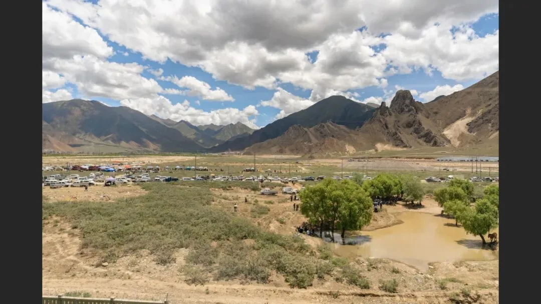
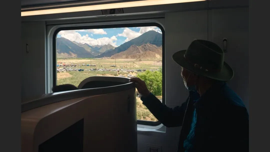
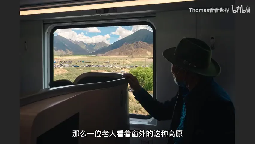
Even documentary-realist work relies on post for expression. In the "Trainscape China" series, both the interior and the view outside the window are real photographs, yet Thomas composites them in post: partly because the glass carries reflections and clutter with a huge exposure gap between inside and outside, and partly to deepen the theme. The frame at 10:25 was taken on the second day of the Lhasa–Nyingchi Fuxing EMU service, when a local Tibetan family rode the new business cabin to witness Tibet's development. In the original, the window frames nothing but a utility pole and an anonymous stretch of trees — hardly a way to convey the collision of eras. So the view outside was replaced with a traditional Tibetan highland market: an elderly passenger sitting inside the modern train, gazing at the market beyond the glass — the dialogue between tradition and modernity becomes far fuller (at 10:40-11:02 in the video).
04 How Much Is Too Much: From Chronicle to Romance
Thomas likes an analogy: what turns a piece of writing from history into literature is the step from Records of the Three Kingdoms to Romance of the Three Kingdoms — the deliberate act of storytelling. Photography works the same way: once a pure science of recording absorbs subjective creation and artistic shaping, the photograph gains real expressive power (at 11:05-11:36 in the video).
That said, not every image needs heavy compositing or wild imagination — many need nothing more than a simple adjustment of tone and color to feel completely different. What matters is understanding what post is for: the curves you pull and the sliders you drag are not just about stronger visuals; on one hand they repair the limits of capture, and more importantly they inject your ideas, emotions, style and vision into the photograph — the essential lesson for the modern photographer (at 11:41-12:12 in the video).
1. Post-processing serves three purposes: fixing capture limits, enhancing the visual result, and injecting personal ideas, emotion, style and vision; 2. For scenes defeated by dynamic range, depth of field or shutter speed, bracket, focus-stack and time-blend — shoot the raw material in the field, finish the blend in post; 3. Visual enhancement is subtraction — darken distractions, remove clutter, level the horizon, let the subject stand out; 4. Higher-level editing is expression: grade the mood and the idea of that moment into the frame so the landscape carries your name — but not every photo needs radical surgery.
PPT