Photography Tutorial · 2024-03-31
How to Strengthen Realism in Post: 'Real' vs 'Real Feel' in Photography
The real world is three-dimensional, continuous in time, and unframed — while a photograph is two-dimensional, frozen, and framed.
And in the real world we have rich sensations of taste, touch, and hearing; our brains automatically focus on subjects that draw us in. A photograph can offer none of these.
So compared with what we feel directly in reality, our perception of a photograph is inevitably somewhat "distorted."
In today's tutorial, we'll briefly discuss "real" versus "real feel" in photography, and teach you a few simple post-processing tricks that quickly boost a photo's sense of realism.
Video
▶ Watch the video tutorial on Bilibili
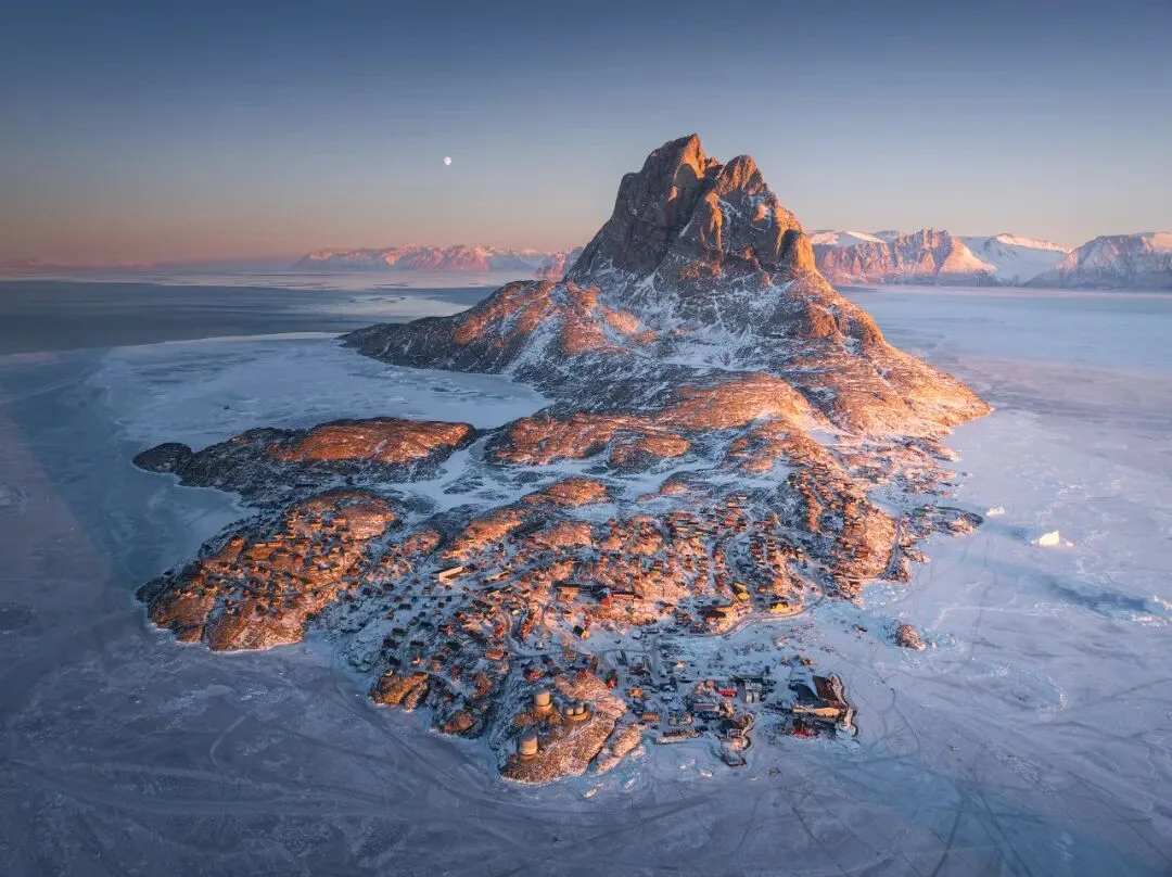
This is the fully illustrated companion to the video above. Using a moonlit snow-mountain frame shot in Uummannaq, Greenland, Thomas first separates 'real' from 'real feel' — a photograph is doomed to lose something, but post can win the lost in-field sensations back — then walks through the full Camera Raw edit: darkening the sky to pop the moon, faking the sunrise-side light with gradient filters, lifting the town as the subject, and restoring the warmth. Four steps below, with keyframes from the video.
Start with the overview. The same real world, seen directly, passes through just one translation — our perception and nervous system; a photograph inserts an extra compression layer between the world and that perception, and that is exactly where the sense of presence leaks away (at 0:27 in the video). Post-processing exists to pay it back.

01 Why Photos Fall Flat: Where Realism Leaks Away
Every photographer hits this at first: the world in front of you is stunning and multicolored, yet the photo looks dull. The video sums the gap up on one card — reality is three-dimensional, continuous and unframed; a photo is flat, frozen and framed. Reality offers hearing, taste and touch; a photo offers vision only. And our perceptual system is far more selective in the real world (at 0:41 in the video).

On location your eyes take in a deep, stereoscopic image; compress it to a plane with a phone and it instantly looks flat (at 0:53 in the video). Two typical examples: a distant animal, person or moon looks big to the naked eye but shrinks into the scenery in a photo (at 1:19); a dawn sky genuinely graduates from deep overhead to pale near the sunrise, yet when the sky occupies just a quarter or third of a landscape frame, that gradient nearly vanishes — even though the gradient is exactly what 'early morning' feels like.

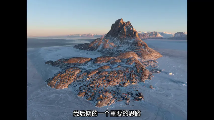
Hence the key idea for this photo: strengthen the sky's gradient — squeeze the huge transition that once spanned from overhead to the horizon into the narrow strip of sky inside the frame. The compression does bend 'the real', but it buys back the feeling of being there (at 2:22 in the video). Next, Thomas demonstrates in Camera Raw how this believable light is built.
02 Rebuilding Tone: Darken the Sky, Pop the Moon
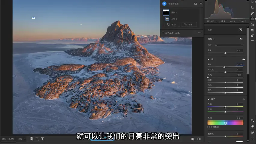
First, the overall before/after (at 2:59 in the video). The most crucial step is tonal shaping, done with several local filters. Problem one: the moon doesn't register — its brightness is too close to the sky behind it, and when two things glow equally, the eye picks out neither (at 3:20 in the video).
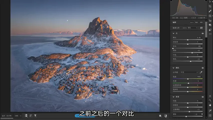
You could enlarge the moon, but that means altering pixels; the pixel-preserving fix is darkening the sky. Select the sky, pull exposure down a touch, then highlights down a touch — the sky sinks and the moon pops immediately (at 3:42 in the video). Then nudge the sky cooler, add a little purple, and ease the overall saturation down for a more pleasing look (at 3:55 in the video).
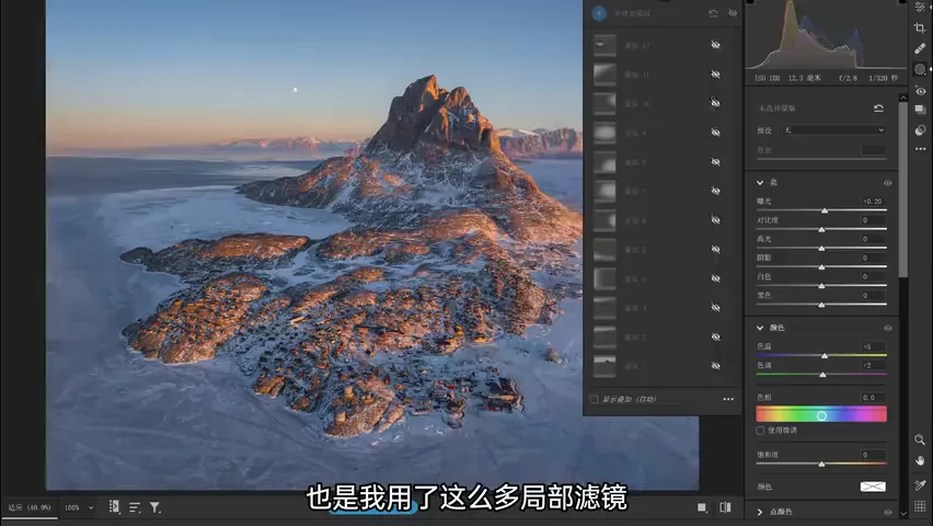
03 Faking In-Field Light: Gradients, Little and Often
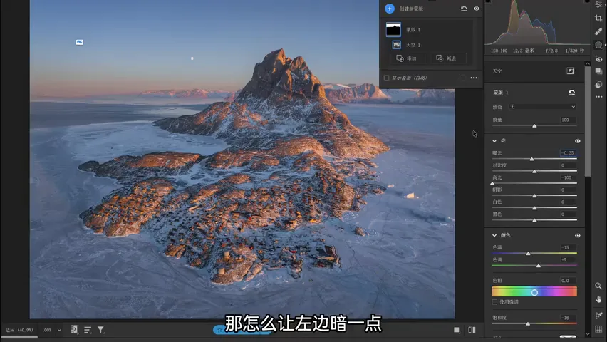
Next: steer the eye to the core of the frame while rebuilding the sensation of on-site light. Standing there, you feel the sun's side is far brighter; but this frame spans a dozen-odd kilometers from left edge to right, and in clear air light barely attenuates over that distance — so the raw file is nearly even left to right (at 4:37 in the video). The left-dim, right-bright feel has to be added in post.
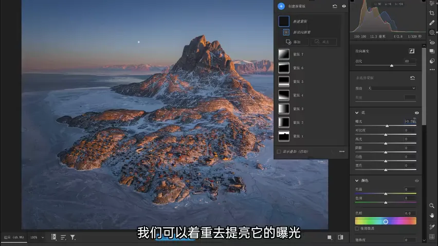
The tool is a local filter — a linear gradient — darkening the left. Thomas's rule is 'little and often': about 0.2 EV of exposure per pass, stacked repeatedly, so different regions are covered while the transitions stay soft and natural; the sky gets its own gradients too (at 5:07 in the video). Then brighten the right side: lift exposure mainly, raise blacks slightly, even add a touch of clarity to fake the texture of light, and warm it up with a bump of temperature and a hint of tint (at 5:32 in the video).
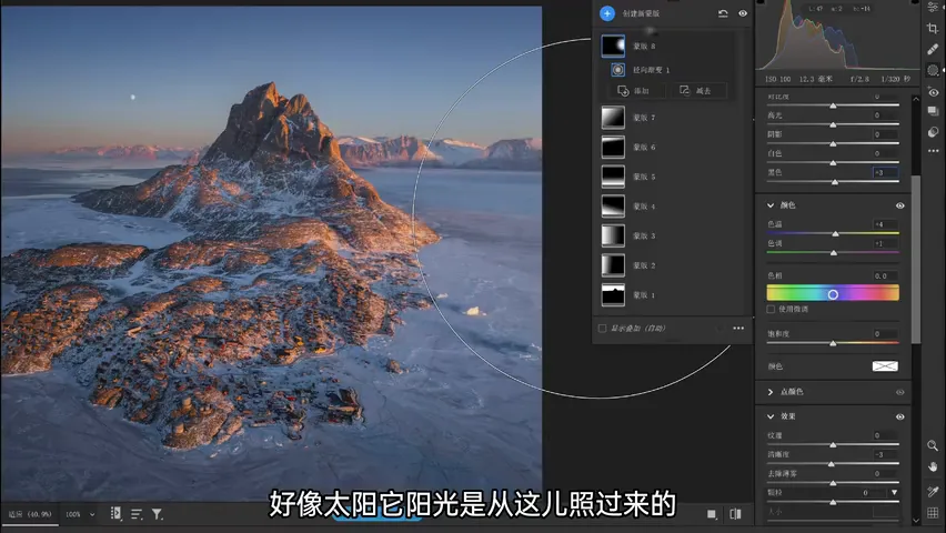
The direction of sunlight gets one more emphasis pass with a radial gradient on the right — mimicking the sun pouring in from that side (at 5:54 in the video). At this point the light has direction: left cool and dim, right warm and bright.
04 Subject and Mood: Spotlight the Town, Restore Warmth
The subjects here are the moon and the little town at the mountain's foot. On location your brain auto-focuses and the background naturally blurs; in a photo where everything is sharp, light-and-shadow shaping has to make the town stand out instead — add a touch of shadow lift inside the town's mask and it instantly turns vivid, the way it would catch your eye on site (at 6:08 in the video).
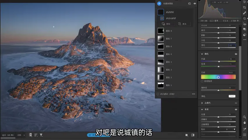
Shrink the masks and step back: the small-size before/after already reads differently — the right side clearly brighter and warmer, the left darker and cooler, the warm-cold contrast now alive (at 6:51 in the video). That contrast carries depth information and pulls the frame together, but it also adds a second layer: the feeling of warmth at sunrise. On site the sun delivers it directly; in the photo, extra warm tones and a touch of magenta have to supply it (at 7:27 in the video).
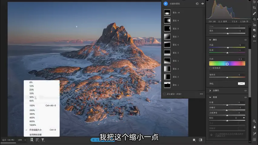
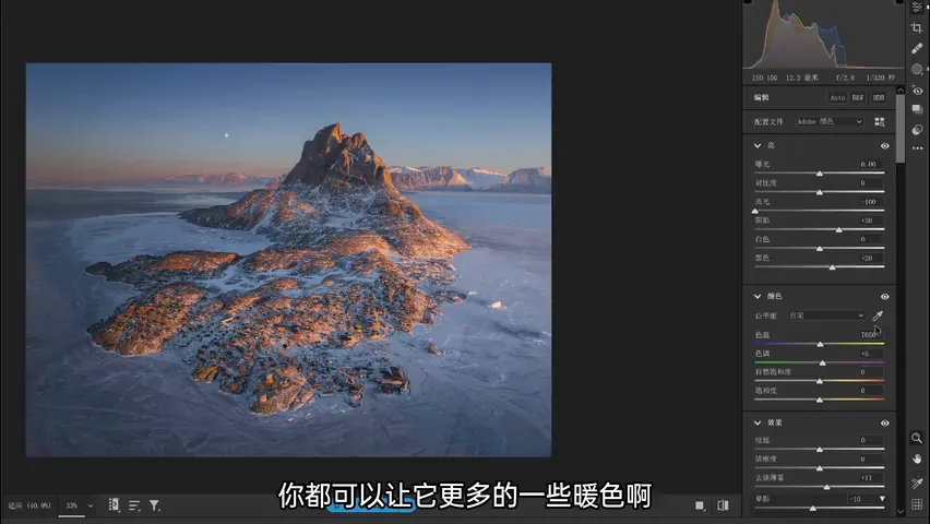
Two finishing moves: a vignette around the edges gathers the eye toward the center (at 7:46 in the video); and there is the deeper logic of darkening the sky — physically the sky is the light source and should far outshine the ground, and the raw file obeys. But on a flat image the eye instinctively lands on the brightest area and the light-dark boundary — here that sky-ridge seam. Only by pressing it back down does the gaze settle on the moon and the town (at 7:55 in the video).
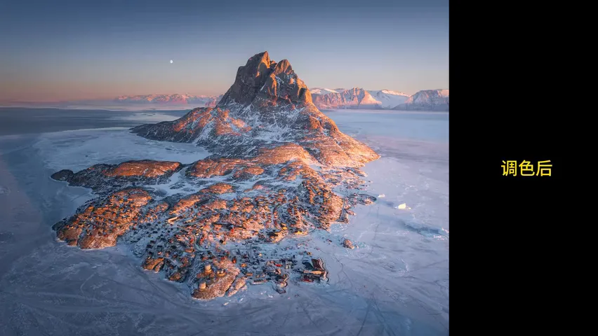
1. A photo is always one layer short of the scene — flat, frozen, framed, stripped of sound and touch — so aim not at physical truth but at the photo's sense of realism; 2. When the subject hides, separate tones first: darkening the backdrop (a touch off exposure, a touch off highlights) beats enlarging the subject, and a cooler, purplish, desaturated sky looks better still; 3. Rebuild on-site light with local filters — linear gradients to dim the shade side and lift the sun side, a radial gradient for the sun itself, remembering '0.2 EV, many passes'; 4. Finish with emotion — warm and magenta tones restore the sunrise glow, a vignette gathers the gaze, and the brightest area is handed over to the moon and the town.