Photography Tutorial · 2017-04-23
The Often-Ignored Color Grading Gem: The Split Toning Tool
When it comes to color grading tools in ACR/Lightroom, we usually think of white balance, HSL, the tone curve and so on.
This article discusses in detail an often-overlooked grading gem in ACR — the Split Toning tool.
1
What is the Split Toning tool
The Split Toning tool sits after the HSL panel — the 5th adjustment panel in ACR and Lightroom. It can add different colors to a photo's highlights and shadows separately — very convenient and useful.
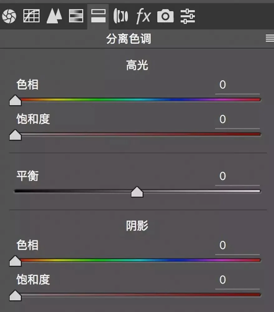
Split Toning has 5 sliders, from top to bottom: Highlight Hue, Highlight Saturation, Balance, Shadow Hue, Shadow Saturation.
Next, Thomas uses this black-to-white gradient image to explain each slider's effect.

At the top of the panel is the Highlights control area; its Hue and Saturation sliders decide the color we add to the photo's highlights.
The hue bar shows a color band from red to blue to magenta. (0 corresponds to red, 120 to green, 240 to blue — very similar to the color wheel values we mentioned before.)
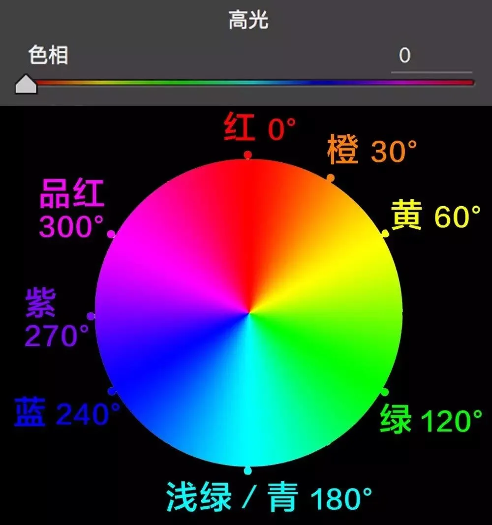
Dragging the Hue slider selects the corresponding color. In the image below I slid Hue to 53, choosing an orange-yellow. But the image didn't change, because Saturation is still 0.
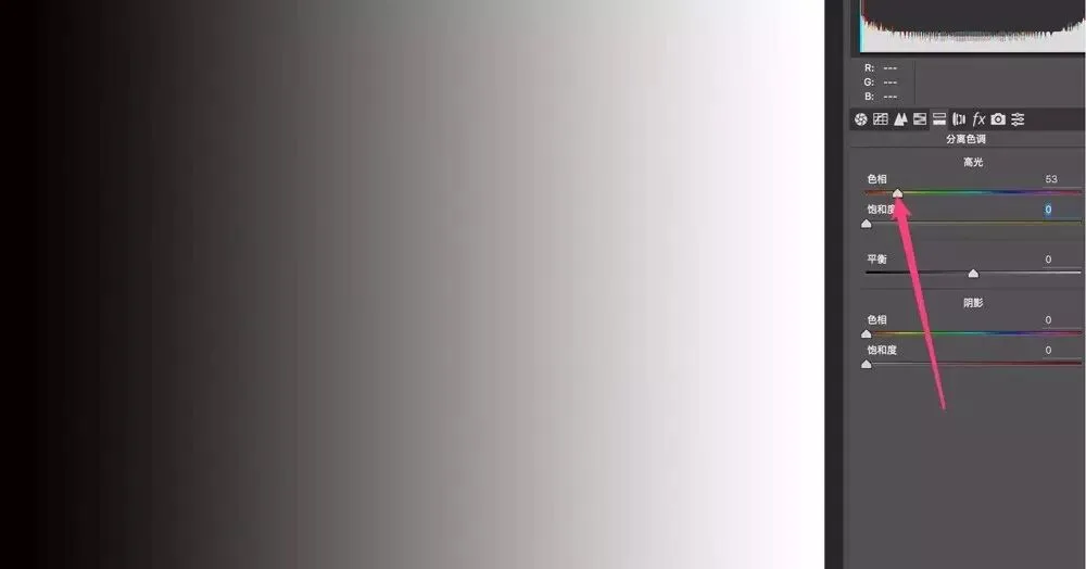
Only when we raise 'Highlights - Saturation' do we see a pale yellow wash added to the highlights and mid-gray areas.
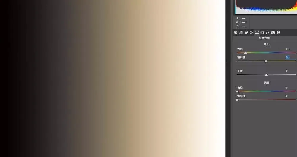
The higher the Saturation, the stronger the added color. When I raise 'Highlights - Saturation' to 100, the brighter areas take on a strong yellow tone.

Shadows work similarly to highlights, with their own Hue and Saturation sliders. Moving them adds the chosen color to the photo's shadows and midtones.
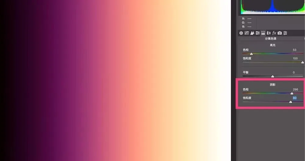
Below, I set 'Shadows - Hue' to 296 (magenta) with Saturation at 80 — the shadows take on a magenta tint.
Note that both the Highlight and Shadow sliders in Split Toning affect the midtones. Below, since I added yellow to highlights and magenta to shadows, the midtones end up showing a blend — orange-red.
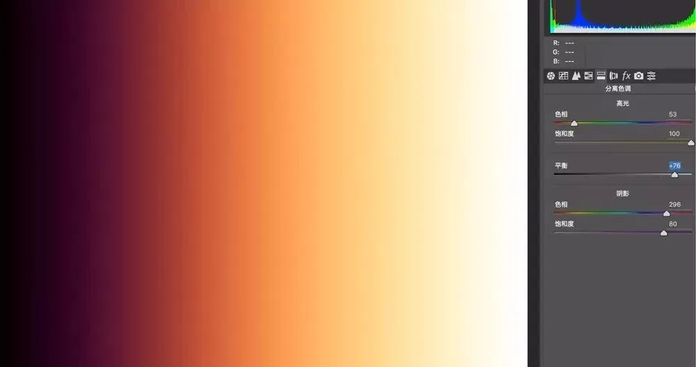
The 'Balance' slider in the middle of the Split Toning panel is easy to understand: it decides the proportion of highlight color versus shadow color in the photo. The default 0 means the two colors are evenly matched.
Move Balance right and more of the photo shows the highlight color. For example, at Balance +76 the yellow added to the highlights spreads into part of the shadows, leaving only a small dark area magenta.
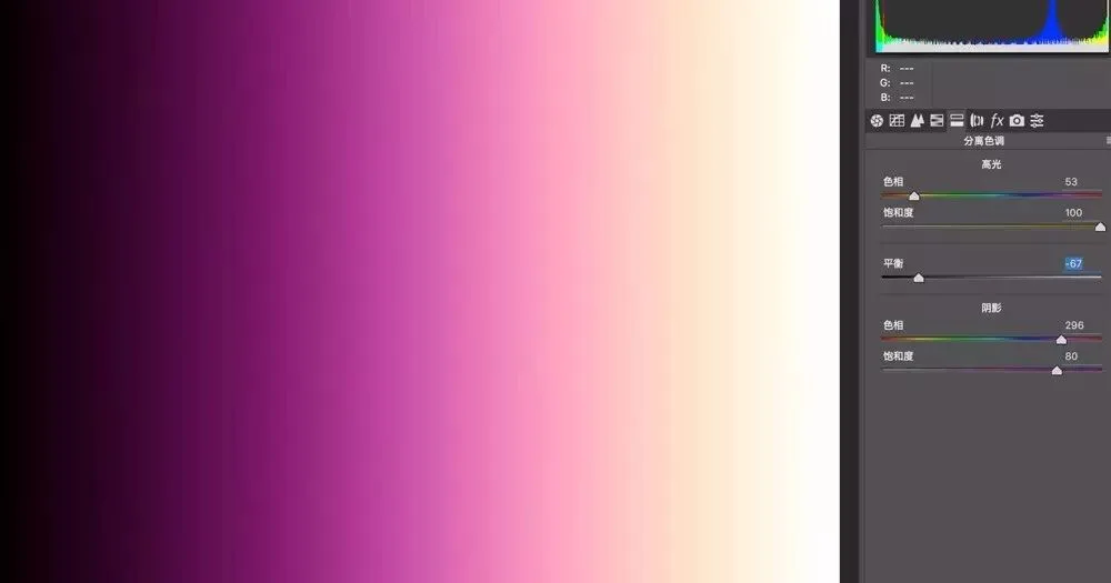
Move Balance left and more of the photo leans toward the shadow color. At Balance -76, the magenta added to the shadows dominates most of the frame, with the highlight yellow acting only on a small bright area.
Now that we understand Split Toning, let's look at practical applications: adjusting local white balance, and adding personalized color.
2
Adjusting local white balance
In Split Toning, the two highlight sliders only affect the brighter parts of the photo, not the dark parts. So we can use Split Toning to separately adjust the colors of a photo's bright and dark areas.
For example, in the image below, a filter gave the shadows a blue cast while the highlights are fairly normal.
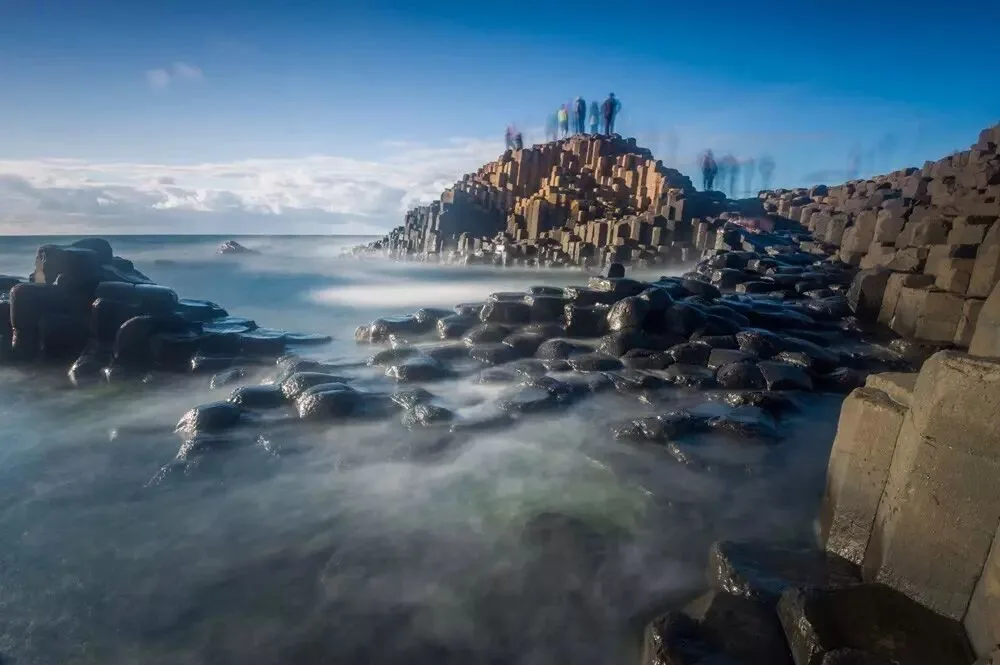
If we used the White Balance tool, the whole photo would shift — correcting the shadow cast would warm the highlights too.
So we can use Split Toning to add warm color to the shadows alone — restoring their white balance while leaving the highlights untouched. We can also move the Balance slider to further limit the range affected by the shadow tint.
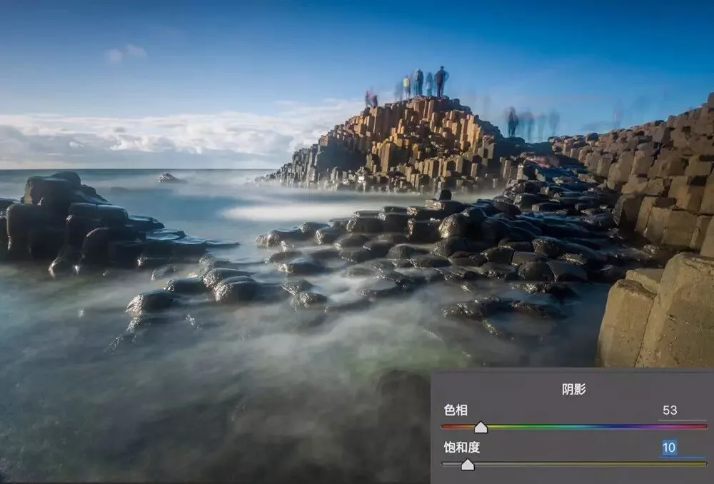
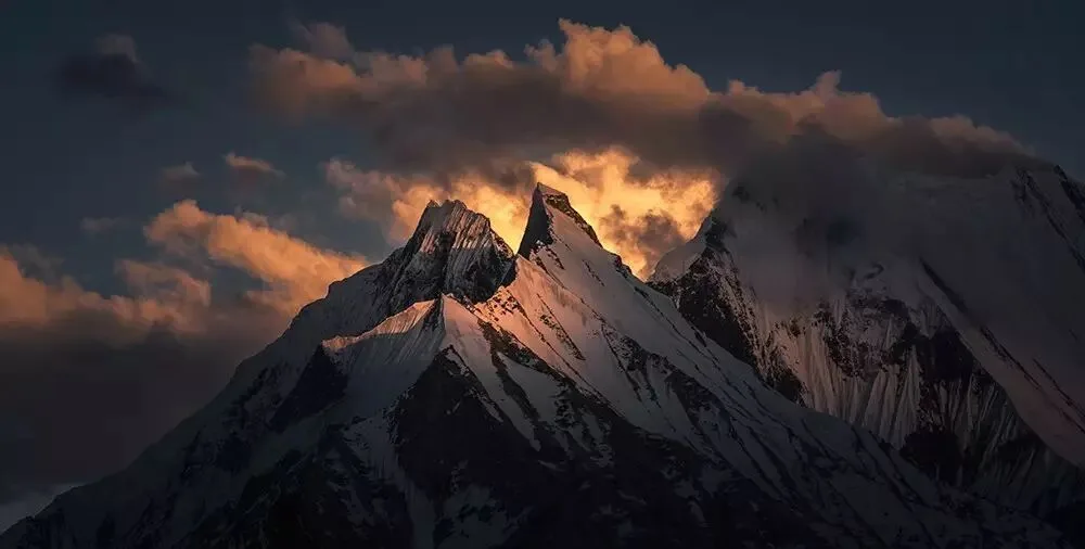
Another example: the image below has fairly normal overall white balance, but I feel the warm glow on the sunlit golden mountain is insufficient.
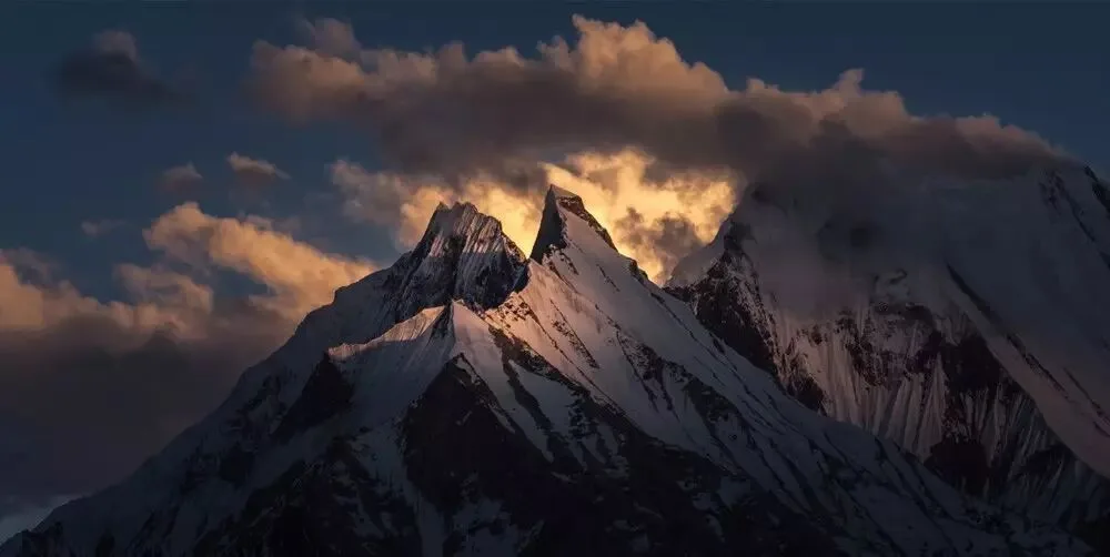
Adjusting the Temperature slider of white balance would give the blue sky and black rocks a warm cast too.
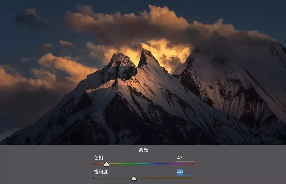
So we use the Split Toning tool: set the highlight hue to 47 (orange-yellow) with saturation 40. Afterward, the sunlit snow mountain and clouds have a richer golden mood, while the rest of the frame keeps normal white balance.
3
Adding personalized color
Besides local white balance, Split Toning has another application: adding personalized grading like sunset yellow, cinematic tones, film tones and more.
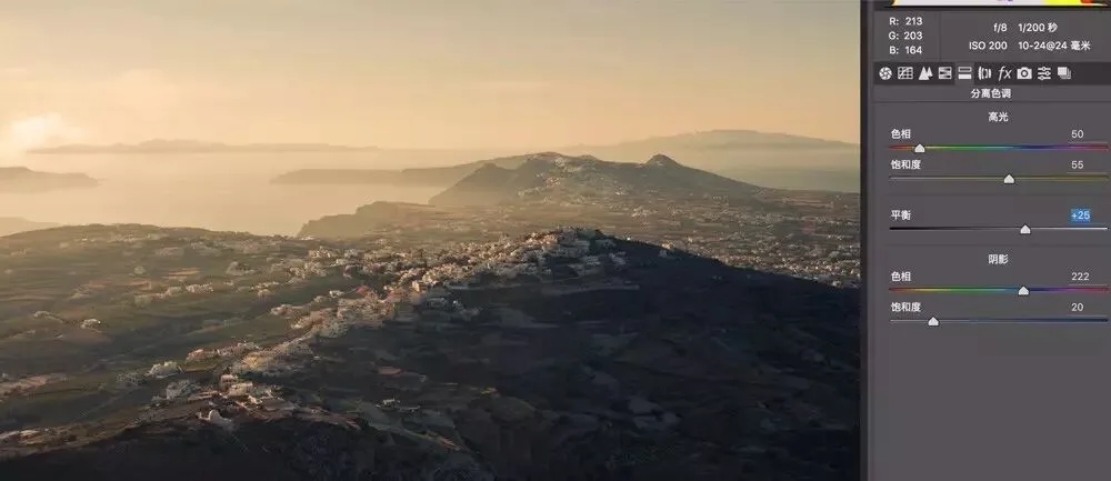
The photo below was taken on Santorini, Greece. Though shot at dusk, the result lacks atmosphere — no feeling of the setting sun at all.
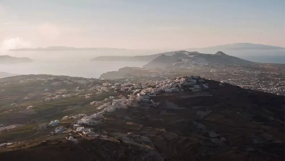
So first I want to add some warm sunset color to the highlights.
Here's a tip: by default, when moving the Hue slider with Saturation still at 0, we can't see the effect of adding that color.
When moving the highlight or shadow Hue slider, hold Alt (Option on Mac) — the preview simulates the effect at saturation 100. This makes it easy to confirm exactly which hue we're adding.
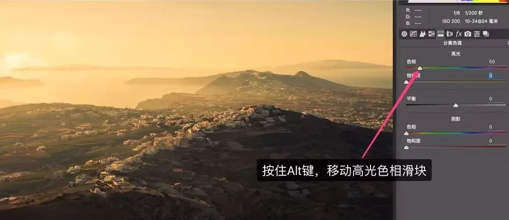
For this image I set highlight hue to 50 (orange-yellow) with saturation 55 — the photo finally has a warm, cozy mood. But with the whole frame leaning warm, it lacks depth.
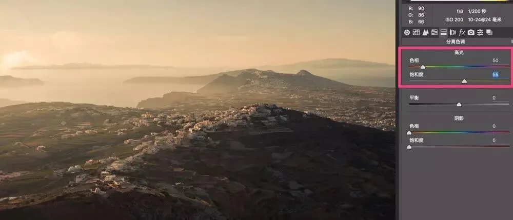
So I added a faint cyan-blue to the shadows (hue 222, saturation 20), keeping the dark areas from getting too warm.
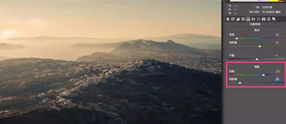
Finally, move the Balance slider to increase the warm proportion — and we get a photo full of romantic dusk atmosphere.
When it comes to emulating cinematic grading, people often think of filters, LUTs and presets. In fact, Split Toning alone can achieve a similar effect.
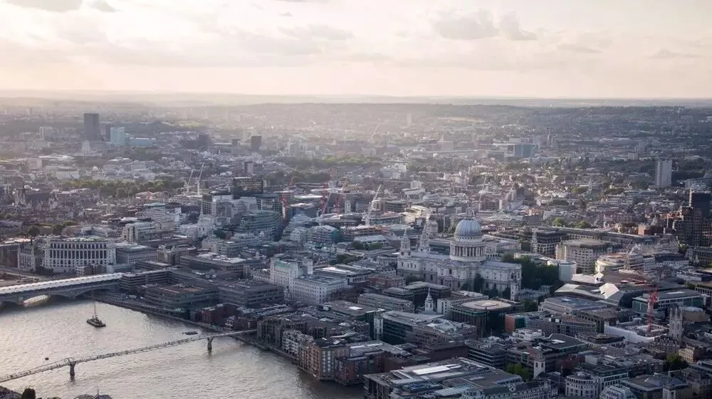
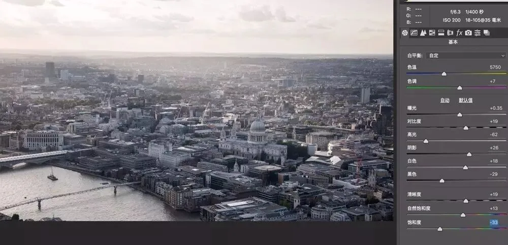
For the photo above, I first moved the overall Saturation slider to -35, reducing global saturation so the original colors wouldn't clash with the cinematic tone I'm about to add.
Then with Split Toning I added orange to the highlights and blue to the shadows.
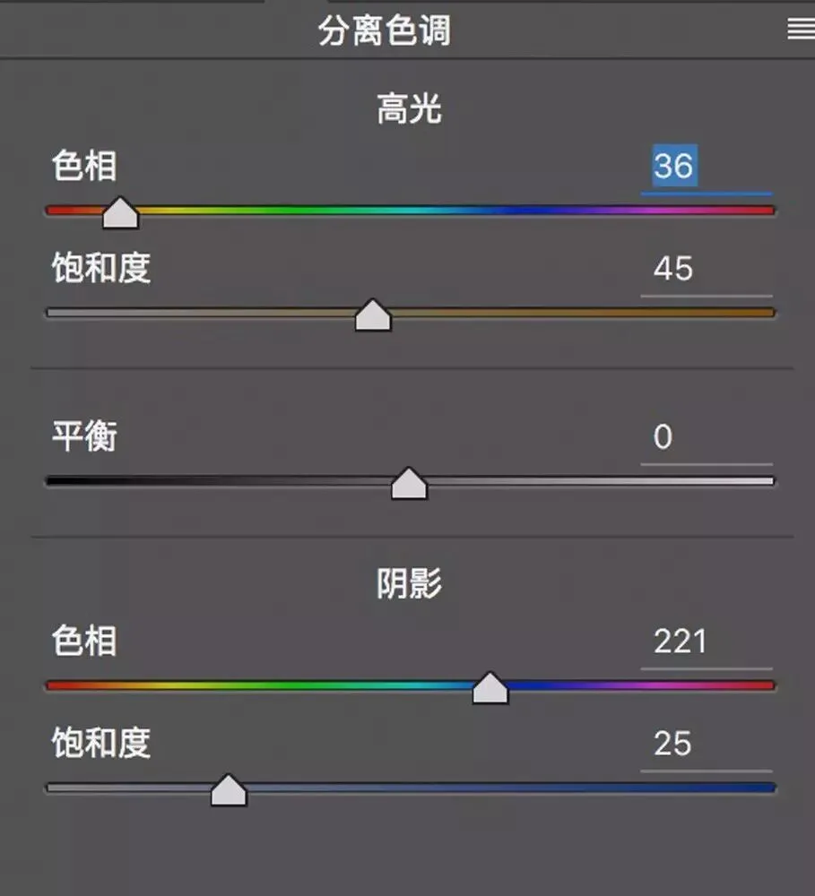
Instantly the photo has that movie/game look — simple, isn't it?
Follow @Thomas Chu Photo — learn one photography skill every week.