Photography Tutorial · 2024-08-04
Photography Really Requires Subtraction to Be Shot Well! Critique of Photos Submitted in the Comments Section~
To shoot photography well, you really need to learn subtraction!
In today's photography tutorial, Thomas selected some submission photos posted by everyone in the Douyin comments section. They share a common trait: they look cluttered because too many details are included.
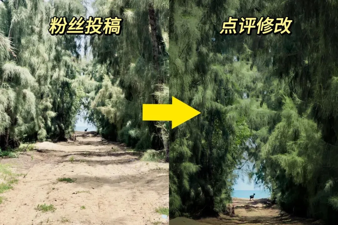
We can not only recrop the images, but also adjust light and shadow in post to make the photos cleaner and better looking!
Video
▶ Watch the video tutorial on Bilibili
This is the illustrated companion to the video above, in which Thomas critiques a batch of photos submitted in the comments section. Their most striking shared problem is one: too much was taken, and the resolve for subtraction was lacking. This article organizes his cropping logic, light-and-dark adjustments and atmosphere makeovers case by case, with keyframe screenshots — by the end you will see that great photographs are often not shot into being but subtracted into being.
Start with a photo rescued by subtraction: a tree-lined path, a lamb at the far end, dense trees on both sides — after cropping and a vignette, the mood is transformed. It is the first case of this episode and the most complete demonstration of "subtraction" (at 1:14 in the video).
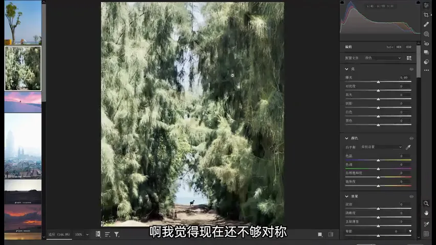
01 A Path Photo, Fully Subtracted
The original capture was actually excellent: a lamb by the sea in the distance, lush trees on both sides (at 0:26 in the video). But the bare dirt road at the bottom was unpleasant and mood-destroying, and the branch on the right was redundant. So crop away the road and the branch, keep left and right roughly symmetrical, and place the lamb in a centrally symmetric structure — the whole image instantly improves (at 0:54 in the video).
Then the subtraction of light: a fairly strong vignette at about 40% with the midpoint pulled inward darkens the bright leaves around the edge and freshens the mood; a new radial gradient selects the lower region and, once reset, adds exposure, so the brightest area builds a lovely contrast with its surroundings (at 1:40 in the video); finally blue saturation is raised a touch — and the color and atmosphere leap forward. That is the magic of subtraction (at 2:04 in the video).
02 Beach and Snow: Hand the Frame to the Subject
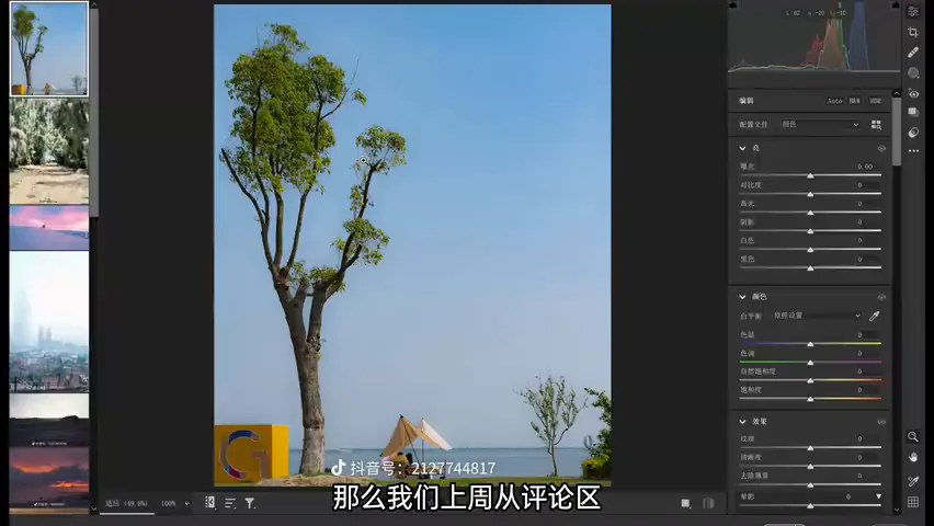
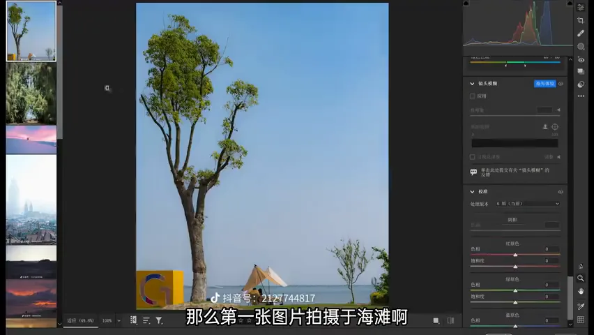
The second photo, a beach: the object on the left does not match the mood of the couple on the sand, and the tree on the right clutters the frame. Crop them away and the photo turns clean at once; then raise blue saturation slightly and lift the shadows and blacks for a fresh candy palette (at 2:17 in the video).
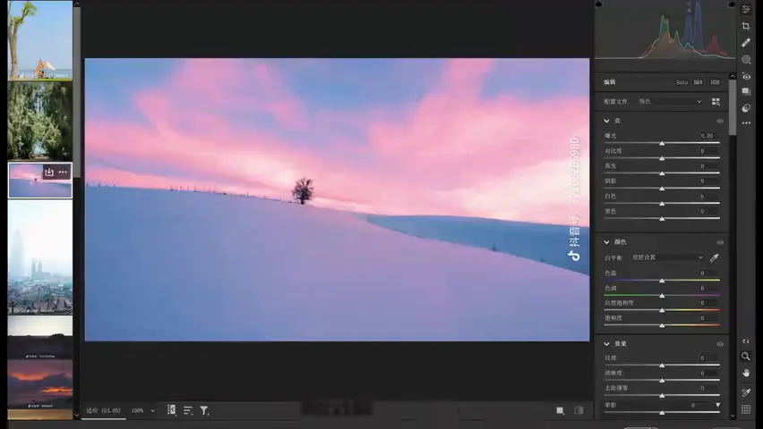
The third, a snow field: the best thing in the scene is the sunset glow in the distance, but the photographer took far too much snow — no footprints, no texture — so most of it is cropped away to let the glow dominate (at 3:05 in the video). The glow itself leans a bit too purple; nudging it toward orange with less magenta looks better.
03 Churches and a Lonely Light: The Dark-Tone Makeover
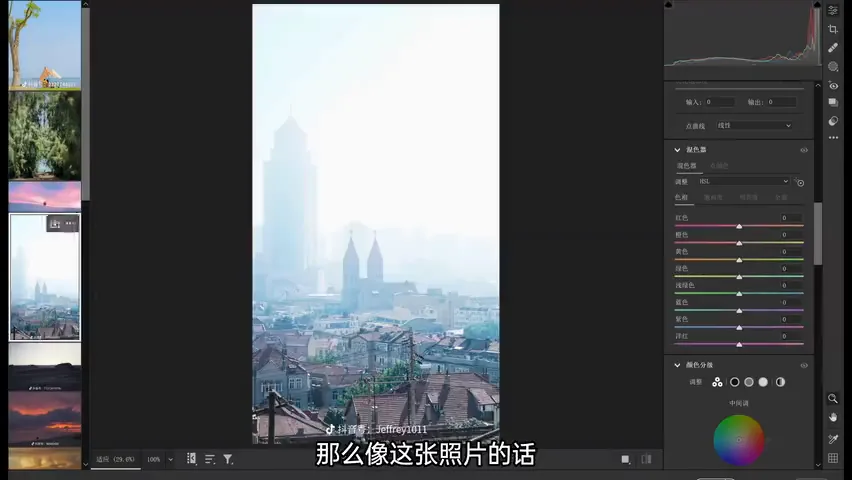
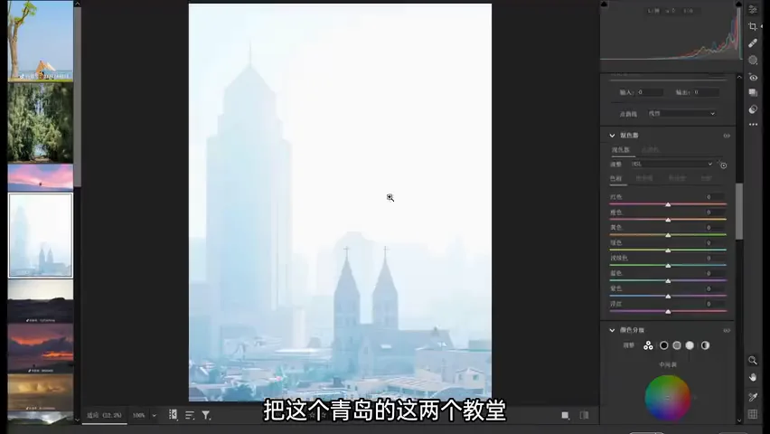
In this photo of Qingdao, the essence is the silhouettes of two churches in the distance; the power poles in the foreground can be cropped out, with the churches placed to the right (at 3:43 in the video). The file is a JPG downloaded from the comments and of poor quality — yet that suits a black-and-white conversion: drop the shadows and blacks hard, lower exposure, lift highlights, and strengthen the contrast. It feels far better than the original high-key, hazy look (at 4:22 in the video).
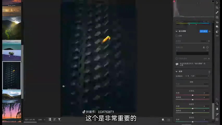
The same logic applies at night: this photographer has a great eye, catching a single lonely light — but the building first needs straightening to true horizontals and verticals, then the surrounding clutter is cropped away (at 8:01 in the video). Darken the edges a touch and add cool tones: cold, bleak surroundings with one lamp burning — the atmosphere arrives instantly.
04 Northwest and Verticals: Space and Renunciation
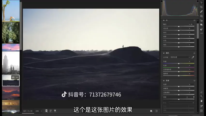
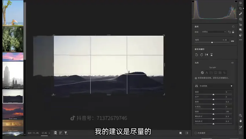
This photo from China's northwest already has mood and suits negative space, but the ground below carries detail that is neither expansive nor interesting (at 4:41 in the video). Put the figure at the one-third line and crop more of the ground — the ethereal feeling of a lone person in an open world appears at once (at 5:01 in the video).
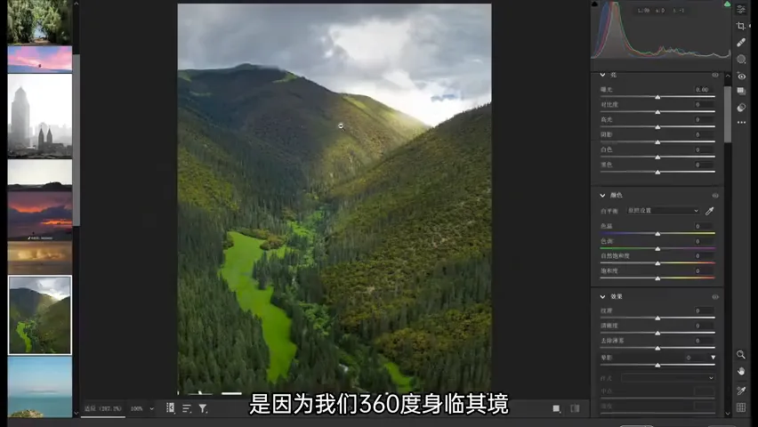
In the meadow photo, the grassland in the middle and the lit clouds are lovely, but the mountains on both sides are not — a vertical crop suits it (at 5:52 in the video). The logic is again subtraction in light: a vignette on the edges, a radial gradient brightening the lit area, plus blacks and a touch of warm red to reinforce the glow; darken the whole slightly, cut the haze, and the formerly flat frame gains a clear focal pull (at 6:44 in the video).
05 Rapid Rounds: Coast, Lavender, Bamboo
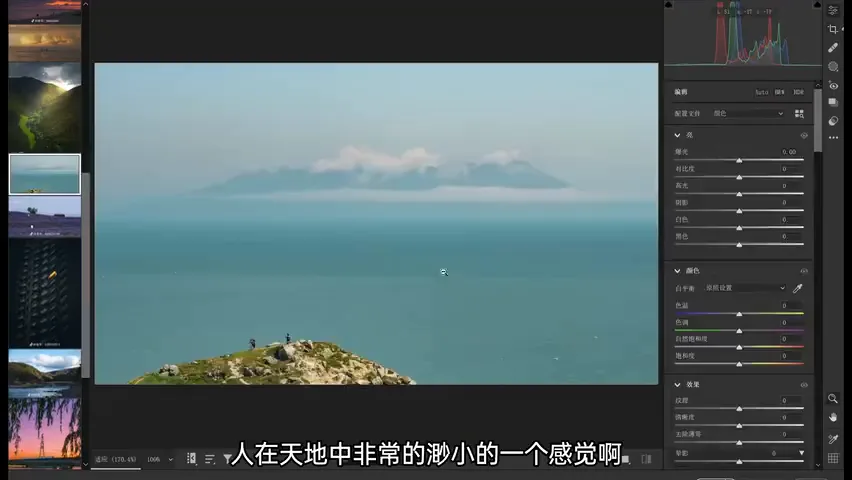
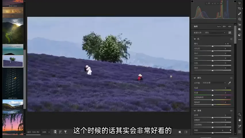
On a seaside shot at high noon, the foreground is a mess — the point is the smallness of a person on the horizon. Take less sky and more sea, then render the figure as a silhouette (at 7:15 in the video). In the lavender field, tree, person and grass tangle together; crop so the tree sits centered with less sky, and the frame immediately improves (at 7:42 in the video).
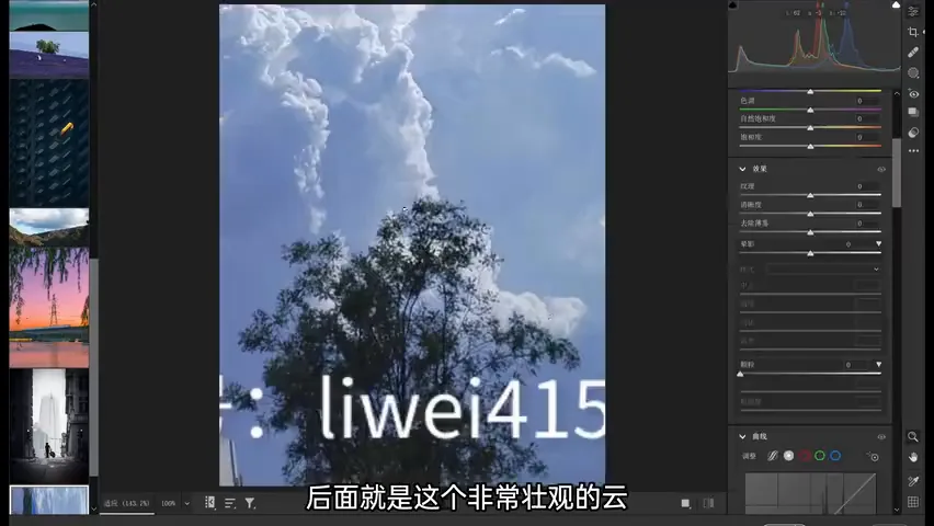
The last one: the clouds are spectacular, but the frame is far too wide. Were he shooting it, he would take just the bamboo grove with the clouds behind — an interesting grove, magnificent clouds, and none of the clutter (at 10:52 in the video). That exposes the common thread of this batch: the problem is not poor shooting but wanting too much. Our eyes find a scene beautiful because we stand inside it, immersed in smell, sound and touch; a photograph must rely on subtraction to reveal true simplicity within a bustling world (at 11:16 in the video).
1. The first step of subtraction is always the crop: remove ugly foregrounds, messy edges and unrelated elements, and hand the frame to the true subject; 2. Negative space is not emptiness: ground and sky detail must either be interesting or be cropped, and a figure at the one-third line reads most ethereal; 3. Light is subtraction too — vignettes press down the edges, radial gradients lift the subject, silhouettes reduce the person, and atmosphere surfaces on its own; 4. The eye's beauty comes from total immersion; a photograph's beauty comes from subtraction — carving simplicity out of a bustling world is photography's real work.
Full tutorial list:
Complete Photography Tutorial Index (updated 2024.4.16)
HD video:
https://www.bilibili.com/video/BV1Ni421a7RM/
Scan the QR code above or click "Read More" at the end of the article