Photography Tutorial · 2023-02-12
Only Cranking Saturation for Sunset Photos? This Post-Processing Approach Works Better
Dawn-glow and sunset-glow photos are a subject landscape photographers shoot all the time.
But when grading, it is easy to go too far — we often see sunset photos with colors so exaggerated they look distorted.
In today's post-processing tutorial, Thomas will share an approach that keeps colors pleasing while still showing the beauty of the glowing clouds.
Video
▶ Watch the video tutorial on Bilibili
This is the fully illustrated companion to the video above. Thomas opens the PSD source file of a sunset shot in Italy and walks through every step of the edit: how to keep the glow beautiful without cranking saturation, and how to rebuild a visual center after lifting the shadows. Keyframe screenshots are paired below — skim them for the framework, then dive into the video for the details.
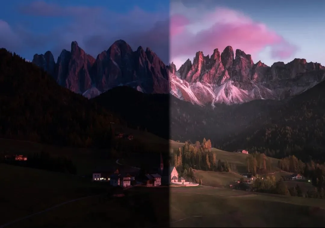
Start with the finished image below — the end result of the whole tutorial: the magenta of the sunset stands out, yet overall saturation stays comfortable, with mountain, village and sky each keeping their own layer of detail.
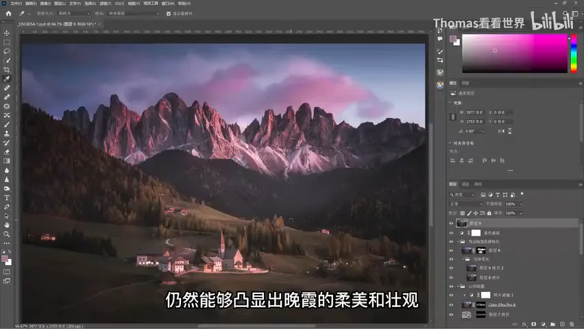
01 The Two Challenges: Color Control and a Visual Center
Sunset photos pose two difficulties. The first is color control: many people keep adding saturation until the glow looks garish and unreal. The second is brightness: the raw file is dark, and that darkness actually makes the focal point stand out — but once you lift the shadows the way so many do, the photo loses its core point of interest (at 0:26 in the video).
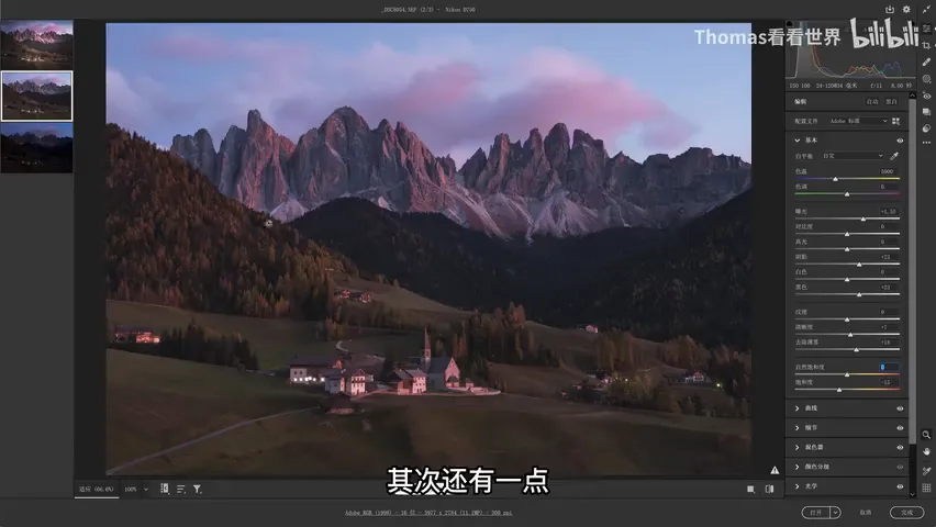
So the tutorial follows two threads: how to combine colors so they stay pleasing, and how to redistribute brightness to rebuild a visual center in a sunset frame. Thomas opens his original working file with every layer visible and reconstructs the edit step by step.
02 Base Edits: Lifting the Image and Separating Warm and Cool
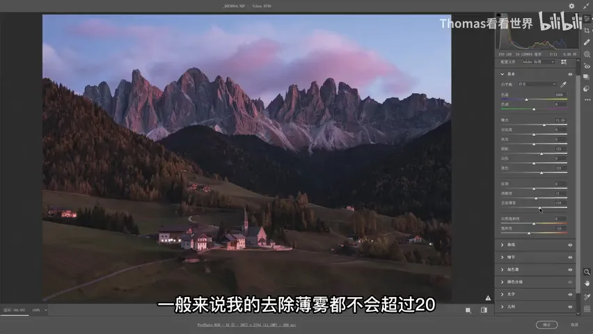
The bottom layer is opened as a Smart Object — edit in Camera Raw, then click Open with Shift held down — so every parameter stays embedded in the file and can be revisited anytime. In the Basic panel the first move is lifting: raise exposure and boost shadows and blacks, since the raw file is dark overall. Add a touch of Dehaze while lifting — Thomas rarely goes past 20 — plus moderate Clarity and Contrast. Saturation, notably, drops by 15: the raw colors are already vivid, so pull them down first and re-introduce the ones you want to accent later (at 1:46 in the video).
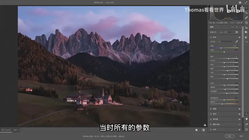
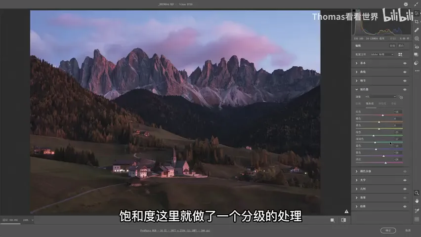
A gentle S-curve handles the routine lift. The real key is the Mixer: hues shift red toward more vivid and purple toward magenta, while saturation is graded — cool greens, blues and cyans come down, warm reds and magentas go up. That gives the photo saturation contrast instead of the uniformly saturated raw file. With contrast in place, the final image can show off the sunset while overall saturation stays modest (at 2:43 in the video).
03 Filters and Local Adjustments: Separating the Colors
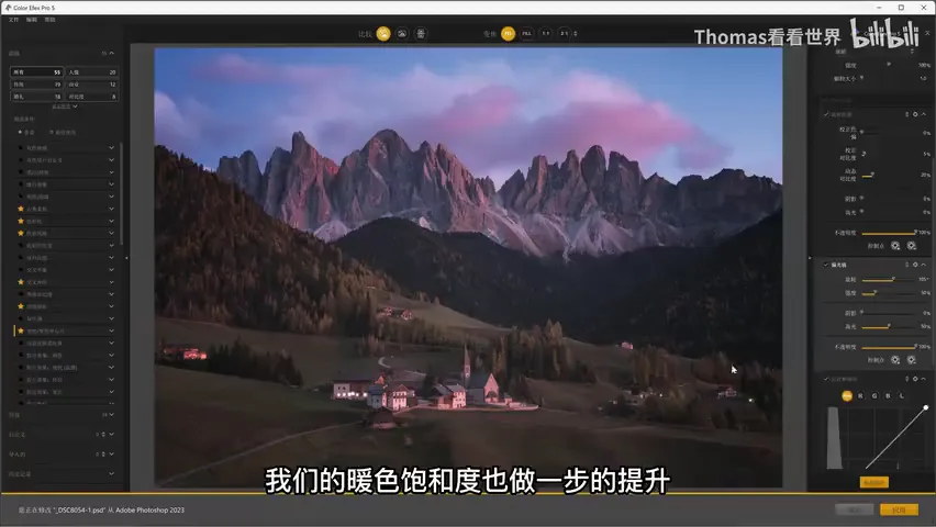
Next comes a Nik Collection filter layer: Tonal Contrast deepens the midtone contrast, while Polarization darkens the blues and boosts warm saturation at the same time — a great combination. A Curves layer adds the classic Darken/Lighten Center, gently pressing down the edges to push the viewer's eye to the middle (at 3:23 in the video).
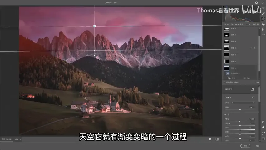
The remaining two Camera Raw filters handle local work, mostly with generous use of Graduated and Radial filters. The sky already darkens gradually, so exposure and warm red are added there — warmth that was not in the original. This step matters because it warms the mountains and the village, creating color separation in the frame. Never let the whole photo go magenta, or the differences between colors simply disappear (at 4:04 in the video).
04 Reshaping Light: Glow Rendering and Painted Haze
After grouping the layers, a selection-based mask isolates the mountain, and the previously introduced "glow rendering" technique comes in: create a blank layer, set its blend mode to Overlay or Soft Light, sample the magenta of the clouds with the eyedropper, raise its brightness and lower its saturation a little, then paint along the mountain. The painting is constrained by masks — including a luminosity mask so only the already-bright ridges are touched — which strengthens the rim light on the peaks (at 4:48 in the video).
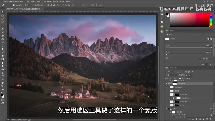
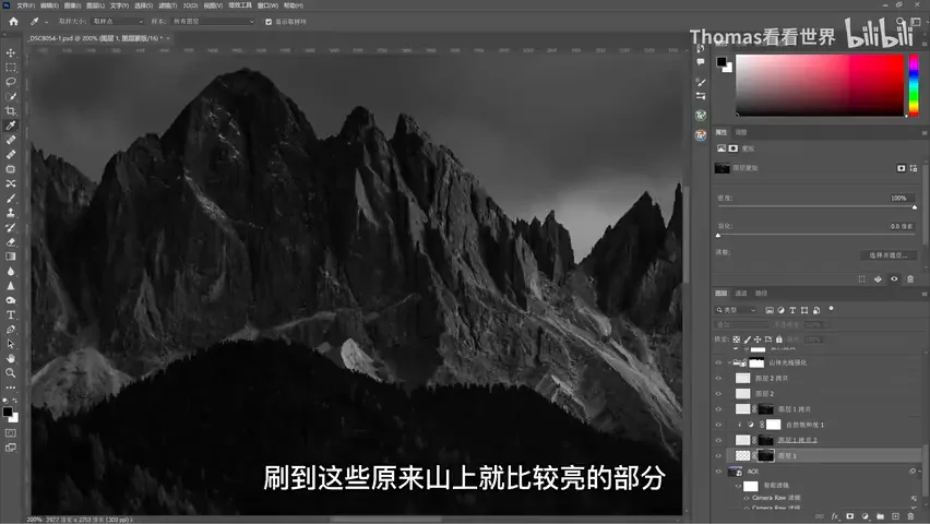
Selective Color then fine-tunes the tone: add yellow, plus a touch of cyan, and keep the image from going too purple. Many people push the sky toward purple as well, so sky and sunset blur into one violet mass and the contrast is gone. After that, a soft selection over the peaks gets a modest contrast boost straight from a Camera Raw filter — that is all it needs (at 5:31 in the video).
Brightness is then fine-tuned to redistribute the light. The lower-right corner has lamps and high saturation, so a desaturating filter tones it down and trims its brightness — the core of this photo is the village in the center, and overly prominent houses nearby would steal attention. An S-curve combined with a luminosity mask builds midtone contrast, and a final Curves lift is masked to brighten only the middle. After this pass the image's center of gravity is far stronger (at 6:04 in the video).
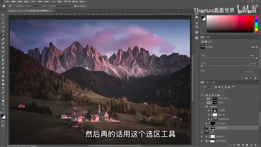
Then comes the painted-haze technique introduced in earlier tutorials: brush a thin layer of mist onto the distant mountains. The photo was too "solid" and lacked depth; the mountains are naturally layered, and with a whisper of haze the foreground stays sharp while the distance softens slightly — instantly more three-dimensional, like the mildly hazy air of a real evening (at 6:57 in the video).
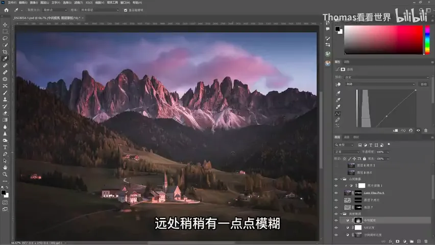
05 Finishing Contrasts: Texture and Saturation Choices
The finish applies softening and sharpening side by side: an overall softening pass first, then sharpening through the Texture slider in Camera Raw. Sharpening is masked too — only the buildings and rocky mountain faces, where texture is genuinely good, get crisped up, while the grass, woods and sky are left soft to set them off. The contrast makes the mountains harder and the meadow softer; the softening works because the sharpened peaks give it something to contrast against (at 7:36 in the video).
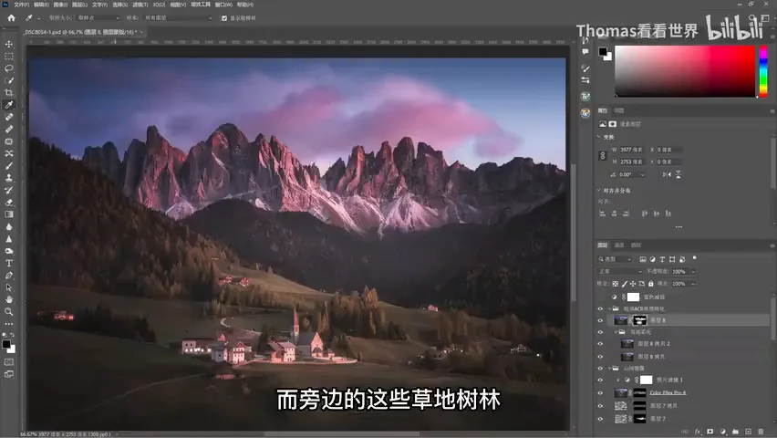
Finally the blues are desaturated even further — still in the name of contrast: if the sky's blue were highly saturated too, the photo would flatten out again. The purple of the sky, in fact, sits at only 31% saturation, not a particularly vivid violet; yet because the blues, greens and yellows around it are held low, it reads as natural and prominent rather than eye-searing. The whole edit is built on contrast: darkened edges for tonal contrast, painted haze for depth contrast, hardened rock and softened greenery for texture contrast — and to make the reds and purples stand out, the real work is lowering the saturation of everything around them (at 8:27 in the video).
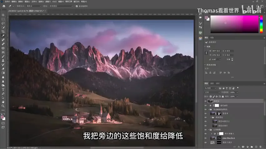
1. Don't crank global saturation on sunset photos: lower it overall first, then grade it in the Mixer — warm hues up, cool hues down — so contrast makes the glow stand out naturally; 2. After lifting shadows, rebuild a visual center: vignettes, graduated filters and a masked Curves lift re-focus the light on your subject; 3. Glow rendering = a blank Overlay/Soft Light layer plus color-sampled painting, constrained by selection and luminosity masks so only bright areas are touched; 4. Sharpen and soften at the same time — sharp where texture earns it, soft where softness helps. Like saturation, texture stays pleasing through differentiated contrast.