Photography Tutorial · 2020-10-25
Hundreds of Popular Color Looks from Just Two PS Tools: White Balance + Calibration Primaries
Thomas Chu Photo
In my book "Foundations of Landscape Photography Post-Processing," I summarized three rules behind popular color grades: a strong dominant color, a fairly unified palette, and complementary color pairings.
The Temp/Tint sliders in Photoshop (the White Balance tool) and the Primaries sliders in Camera Raw's Calibration panel can unify a palette, establish a dominant color, and add warm-cool contrast.
These two sets of sliders appear in many trending color grades, and today Thomas explains them in an accessible, in-depth way.
Video Tutorial
▶ Watch the video tutorial on Bilibili
This is the fully illustrated companion to the video above. Using just two tools — the Temp/Tint (white balance) sliders in the Basic panel and the Primaries sliders in the Calibration panel — Thomas turns a Nanjing Road night shot into blue, orange-teal and cyberpunk purple, and morphs one desert into pink, chocolate and blue. The secret behind trending color lives in these two slider groups. Keyframe screenshots accompany the text: read here for the logic, then follow along in the video.

01 Temp and Tint: Draping the Whole Frame in a Base Color
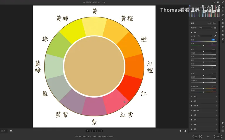
The fastest way to understand these tools is to experiment on a color wheel with neutral gray at its center (at 0:33 in the video). Drag Temp left and the whole photo gets veiled in blue — vivid reds, oranges and yellows suddenly look muted, as if padded with a cool layer; drag it right and everything leans warm and orange, the cold tones losing their edge and turning soft.
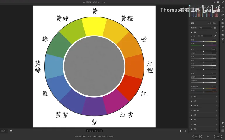
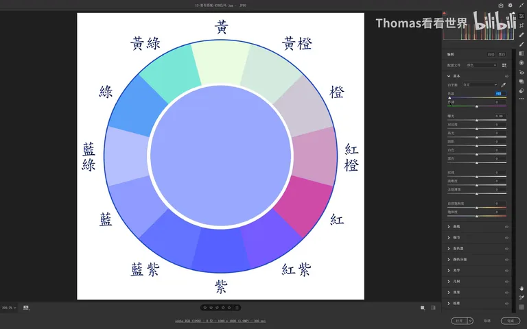
Tint works along another axis: left shifts everything green, right shifts it purple. Combined, the two sliders can bias a photo toward almost any color — for an overall red cast, remember yellow mixed with violet makes red, so push Temp and Tint right together (at 1:38-2:12 in the video). The job of Temp/Tint is to lay down a unified dominant color — the base layer of your grade.
02 Calibration Primaries: Pulling Hues into Complementary Pairs
The Red, Green and Blue Primary sliders in the Calibration panel are cleverer still. Take the classic Blue Primary: drag its Hue left and every warm color shifts toward orange-red while every cool color shifts toward cyan-blue — hues get unified, but not into one color; they split into the beloved orange-plus-teal complementary pair (at 2:33-2:59 in the video). Drag it right and they unify toward yellow-green and violet. And pushing the Red Primary's hue right yields the classic yellow-orange-and-blue pairing (at 3:27 in the video).
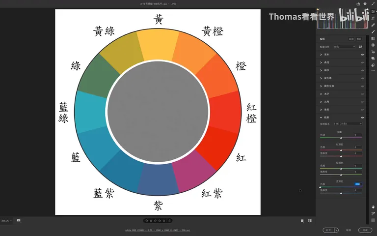
One detail matters: the Calibration sliders do not act on neutral gray, black or white. That's why white balance always goes first — give the midtones a basic cast with Temp/Tint, and only then will the primaries drag those tinted grays along with the rest of the colors (at 6:22-6:50 in the video).
Look back at the three rules summarized on page 99 of "Foundations of Landscape Photography Post-Processing" — a strong dominant color, a fairly unified palette, and complementary pairings — and you'll see they map exactly onto these two tools: Temp/Tint unifies the hue and sets the mood, while the Primaries build a dual dominant of one warm and one cool color, inherently complementary (see the book page at the top, at 4:15 in the video).
03 Practice I: Reinventing a Nanjing Road Night Shot
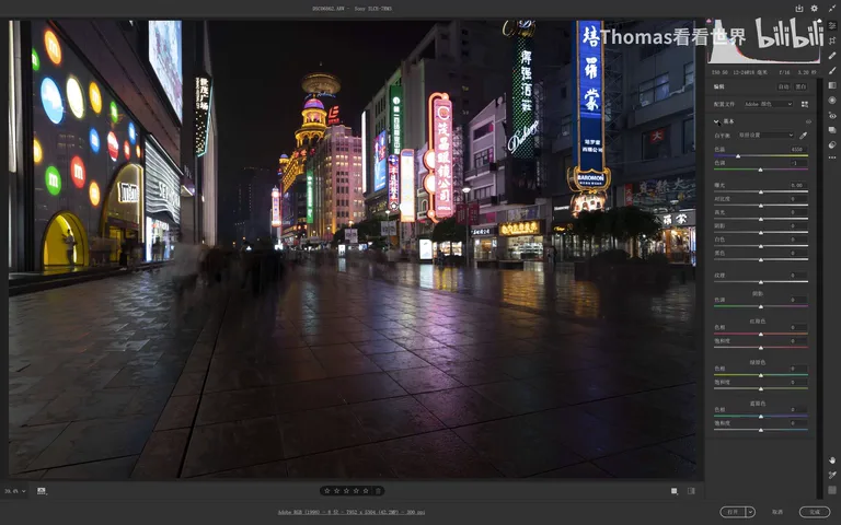
The first demo is a night shot of Nanjing Road in Shanghai, and straight out of camera it's thoroughly ordinary. Want that "blue hour" look even when you shot long after dark? Simple: drag Temp left and the whole frame gains a blue base (at 5:34-5:58 in the video). This step has a bonus — once the neutrals carry a cast, the Calibration sliders finally have something to push against.
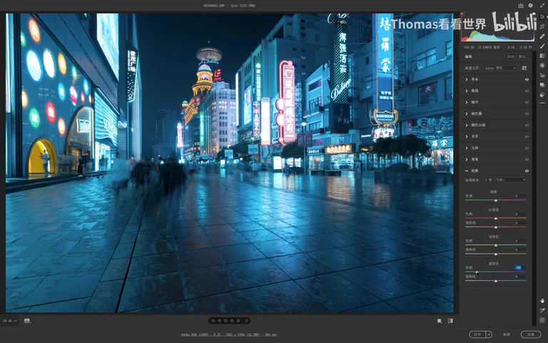
With the cool base in place, pull the Blue Primary's hue left and the famous orange-teal grade appears at once: the lights turn golden, the shadows lean cyan, and warmth and coolness each find their place (at 6:13 in the video).
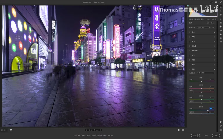
Chasing a cyberpunk look? Push the Blue Primary's hue right and the photo instantly turns purple (at 6:56 in the video); pair it with the Red Primary pushed right — warms go yellow, cools go blue-violet — and you get the yellow-blue contrast. For this shot Thomas chose a middle path: blue shadows with a touch of cyan, plus slightly orange lights, mixing his own intermediate colors from the two primary sliders (at 7:06-7:45 in the video).
04 Practice II: One Desert, Four Colors
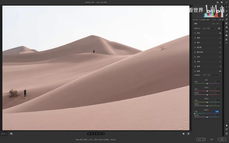
A recent set of pink, blue and green desert photos went viral, and both tools can produce them all. Pink desert: drag the Blue Primary's hue left, and the warm sand naturally drifts toward red-orange — one more nudge lands it in pink (at 8:13-8:25 in the video).
Chocolate desert: dragging the Blue Primary left already hints at chocolate, but it's too red — and chocolate is a heavily yellow color (think of the bar in your kitchen), so push Temp right and the rich chocolate tone emerges; drop the exposure a touch and it tastes even more like dark chocolate (at 8:30-9:05 in the video).
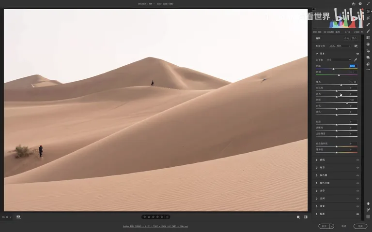
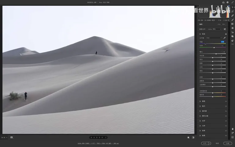
The cool desert is the easiest: Temp left, and a blue desert appears. If the blue doesn't look right, fine-tune with the primaries — the Red Primary pushed right purifies the blue; if saturation falls short, nudge Temp a little further left, landing on that comfortable, harmonious, high-key blue (at 9:09-9:49 in the video).
1. Temp/Tint lays the base: it unifies hues, drapes on a dominant color, and tints the neutrals to prepare for Calibration. 2. The Primaries split the field: they pull all hues toward a complementary pair — orange-teal, yellow-blue or yellow-green-violet — building a dual dominant in one move. 3. Order matters: white balance first, primaries second, because Calibration ignores neutral gray, black and white. 4. The formula behind trending grades = strong dominant + unified hues + complementary pairing, and these two tools each cover half of it.